The Visual Design
A great design, takes flight.
As digital experiences continue to reshape the way people plan and manage their travel, airlines must optimize their mobile app design to drive customer engagement. Travel experience is rarely lukewarm. It’s either satisfactory, or downright poor. Nowadays, many travelers rely heavily on mobile apps to organize their voyages. This means a good travel app's user experience revolves around speed and efficiency. The key thing to to keep in mind is that users are extremely demanding. They’re using a display with very limited real estate, they’re pretty much always on the go, and in that challenging environment, they’re looking for a quick solution to a problem.Whether it's booking a flight, checking-in, or monitoring flight status, this creative solution allows all this through ease of use and speed. With it's immersive images and straight-to-the-task navigation, delight awaits all who require access for their travels. Thoughtful attention has been paid towards user’s goals as the UI keeps everything simple and intuitive. Very few taps are required to accomplish core tasks as users are presented with an immediate set of options to move forward in accomplishing their goals.
This creative design direction was part of a new business pitch while I was working with an app development firm.
COLOR PALETTE
A color palette that is minimal so as to integrate effectively with the brand. However, strong enough to accentuate key elements of the UI.
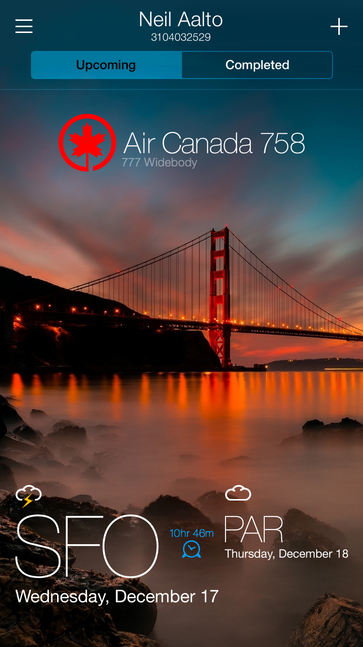
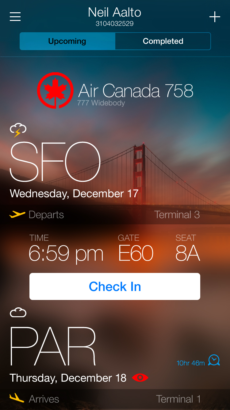
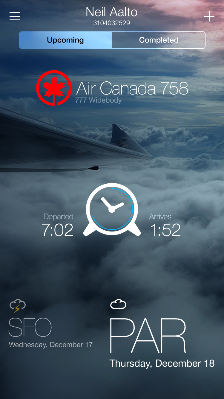
MINIMALIST INTERFACE
All of your travel information is at your fingertips through the super clean and minimal interface design. All essential flight information is presented through elegant typography.
EASY & CONVENIENT
A dynamic UI that allows for quick and convenient booking of flights and managing of trips on the go. Up to date notifications about flights, gate changes and cancellations, empower the user.