Retiree Healthcare Marketplace | Case Study
Boundary breaker. Marketplace maker.
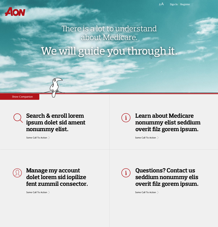
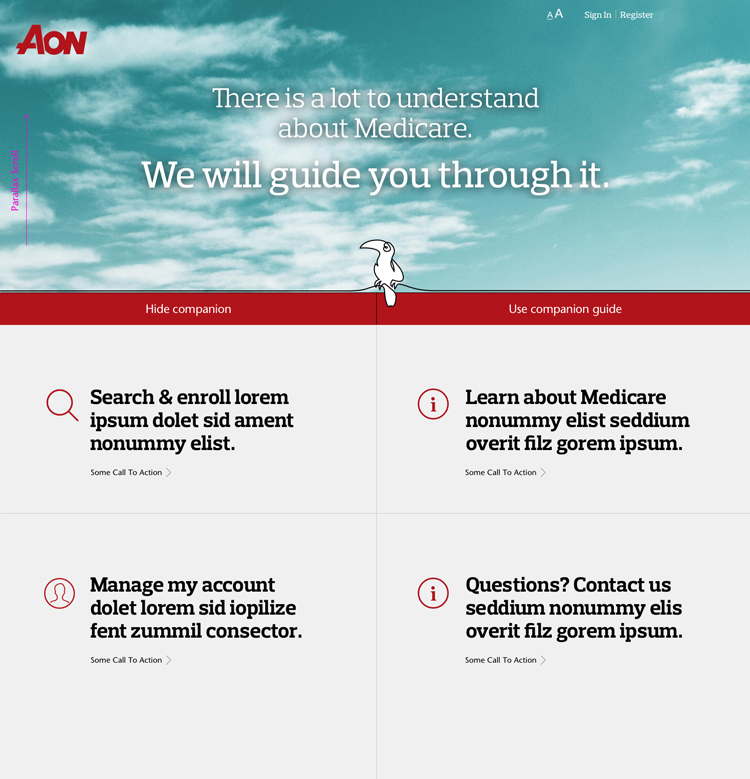
Sleek, intuitive and designed to enhance your browsing experience - this redesign is all about simplicity and elegance. With a clean and minimalist aesthetic, navigating the confusing world of Medicare has never been easier. Completely re-imagined as a dynamic and modular layout, the all new Medicare Marketplace now exudes sophistication and ease of use.
Before. After. Behold.

Welcome
To the jungle.
I always ask questions. A lot of questions. As a continually curious designer, it's essential for the creation of great work. Could I have possibly had the foresight though, to inquire about any problems accessing the current design assets - since the group had just completed an engagement with a design firm?
Perhaps. As it turned out, when it came to the design assets there simply weren't any! They did exist, but sadly the design firm hired prior refused to release them upon their termination. I can't get into the details - let's just say it left me with no graphic source files whatsoever. So before - actually during my other daily tasks - I had to re-create every element, component and layout within Sketch. As the saying goes, it was like upgrading the engines of a plane while in flight. To top it off, it would takes months before I had appropriate corporate issued hardware/software necessary for me to do my job. I adapted, working back & forth between my well equipped personal machine and their limited PC. I don't blame my manager. He hired me because he was the one individual that knew the importance of serving the user. As his first full-time product designer hired to the group, he simply didn't know what he didn't know (I needed). From my start, I was innately aware that the product was in dire need of my skills. I hold the belief that healthcare, particularly Medicare, is often overlooked by great designers. This is why I decided to come aboard a few years back. I'm confident that my work has the power to have a positive impact on our user's lives. What can I say, I like a challenge!
The bad. The good. The crazy hours.
No Design System Library
No design assets existed. I had to re-create or reverse design every icon, component and page from the existing HTML as working Sketch files.
Yay, A Responsive Design
The site had recently been rebuilt to be responsive. I at least did have some reference points in this regard, as I set off establishing core working graphic files.
So Many Time Zones
We were a dispersed, remote team. I had to coordinate and manage deliverables globally across multiple time zones. My day would now begin at 4:30 AM.
25 Minutes
0.Challenge
Bubble to the surface.
Crystal clear vision and purpose are driving forces behind great design. They serve to provide designers and engineers both the freedom to innovate and guardrails of which to run up against. As we begin, a laser-focused understanding of the why, the what, but not necessarily the how - with regards to the product or feature being explored - is paramount.
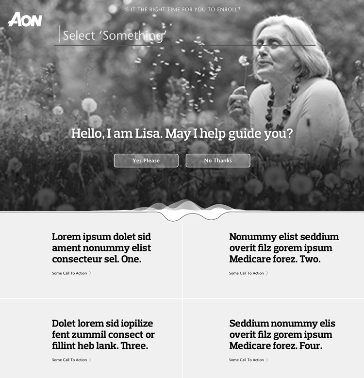
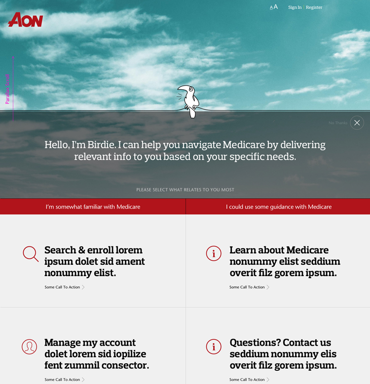
As a product designer, I constantly strive to make user interfaces and journeys simpler while decreasing friction. Users approach products with a specific goal in mind. My job is to help them accomplish their goals in the most direct and delightful manner possible. But before anything could be created, context for our effort had to be understood. I engaged a cross functional, multidisciplinary team to work as a unified group towards the same goal. In this discovery phase, the team aimed to uncover all knowledge of the perceived problem we were attempting to solve. This perceived problem or assumption was validated by data from both the customer and the business. With limited digital literacy, seniors frequently struggle to effectively navigate digital products. Interactions are further complicated by a degradation of cognitive and motor skills. Our product required a transformation to more effectively meet the needs and capabilities of our primary user base, with the business goal of reducing support calls. My early research led me to the theory that by surfacing critical information immediately after authentication, we could potentially reduce cognitive load through reduced navigation. Relevant account information could be presented early in the journey and within a glance - fast to scan and easy to comprehend. The homepage was without doubt the best initial candidate to test my theory. This approach further aligned perfectly with a business need of greater flexibility around the timing or delivery of content. The desire to surface timely and actionable elements with the least amount of user interaction would become one of my overall guiding design principles. The above mentioned user challenges were some that naturally came with this space. Additionally, nearly everything I did, or tried to do, fell under various compliance regulations that impacted my work. Occasionally, these regulations even prevented me from realizing certain creative concepts altogether. Once a clarity of purpose was understood and everyone was on the same page, it was time to get started working on possible solutions.
1.Ideate
A sketchy start.
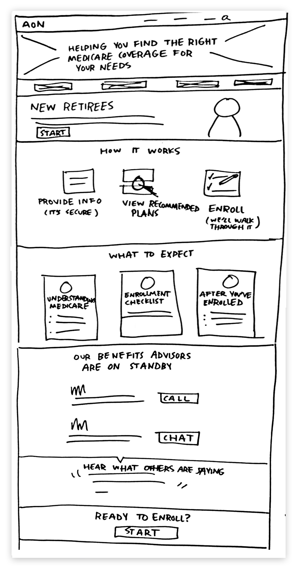
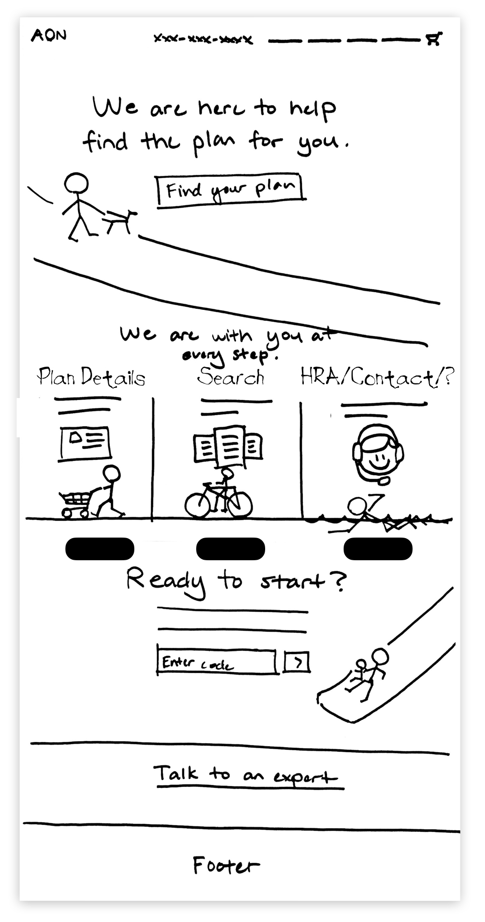
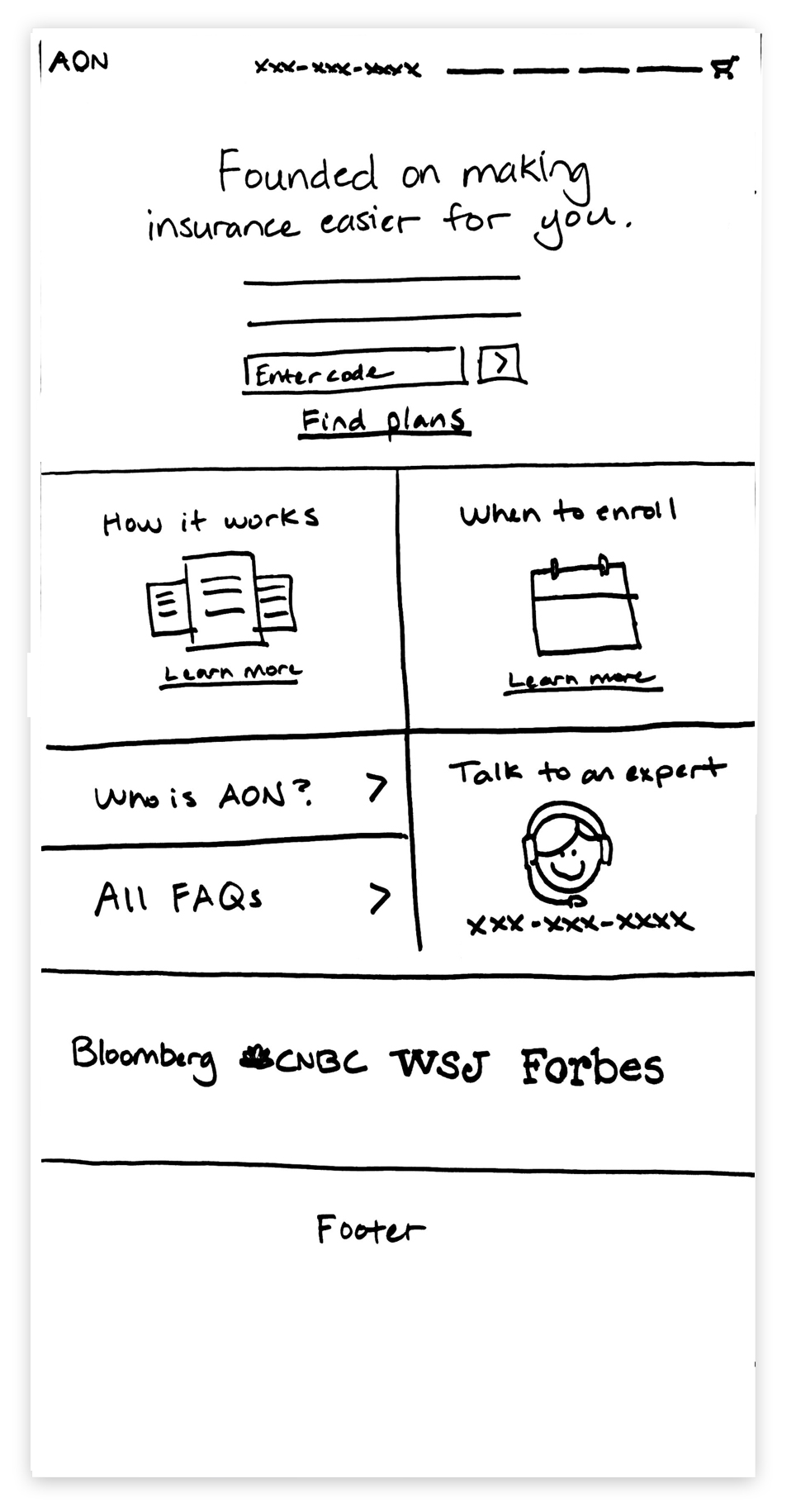
Guided by user data and with our hypothesis in mind, I doodled, scribbled and sketched. Fidelity wasn't the objective - rather, a multitude of ideas. The purpose here was to quickly get a good sense of what the user experience might be like, all along avoiding any premature refinements.
Now comes the phase in the process where I'd love to share how we, as a unified team, enthusiastically participated and engaged together. Truth is, that's sadly not how this organization operates. This wasn't without a lack of effort on my behalf. Since my initial early days, I established and communicated the importance of process to everyone I encountered. When it came to participation, most were simply reluctant to take the time or make the effort. Therefore, I did my best with all I had, to keep this a true team initiative while still moving the work forward. We agreed upon two high-level directives to guide me during explorations:
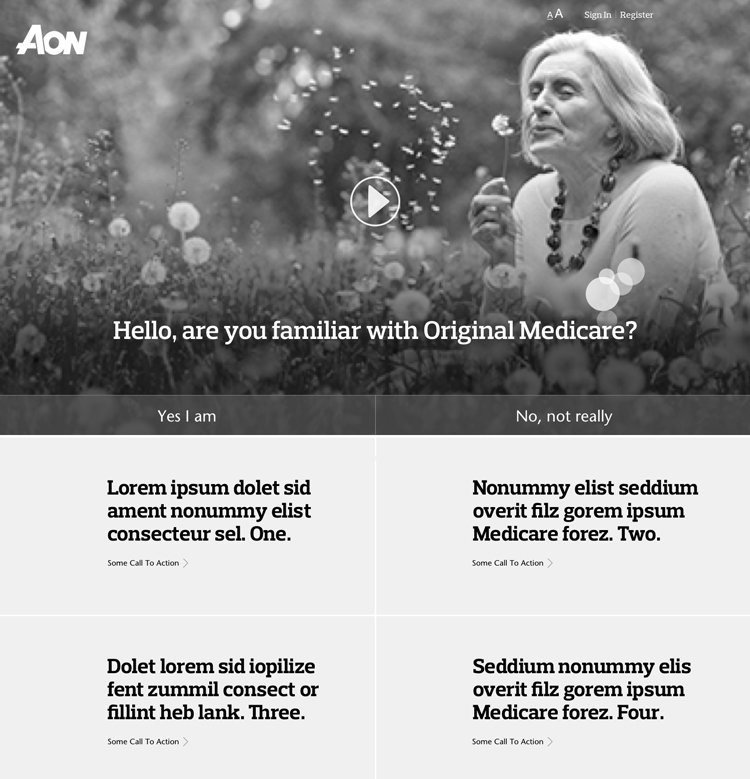
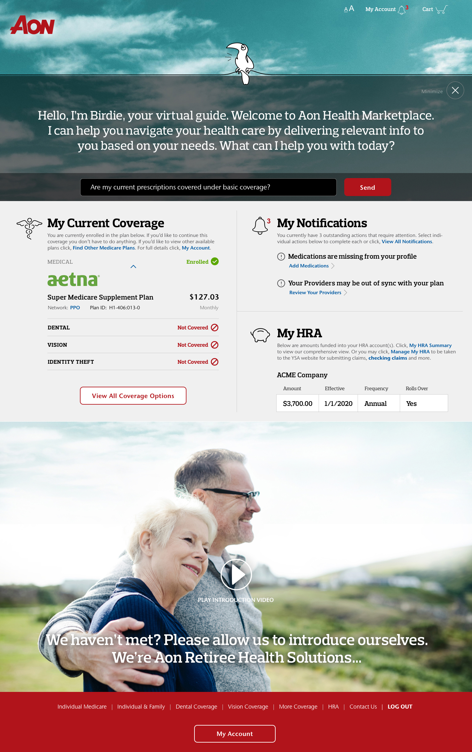
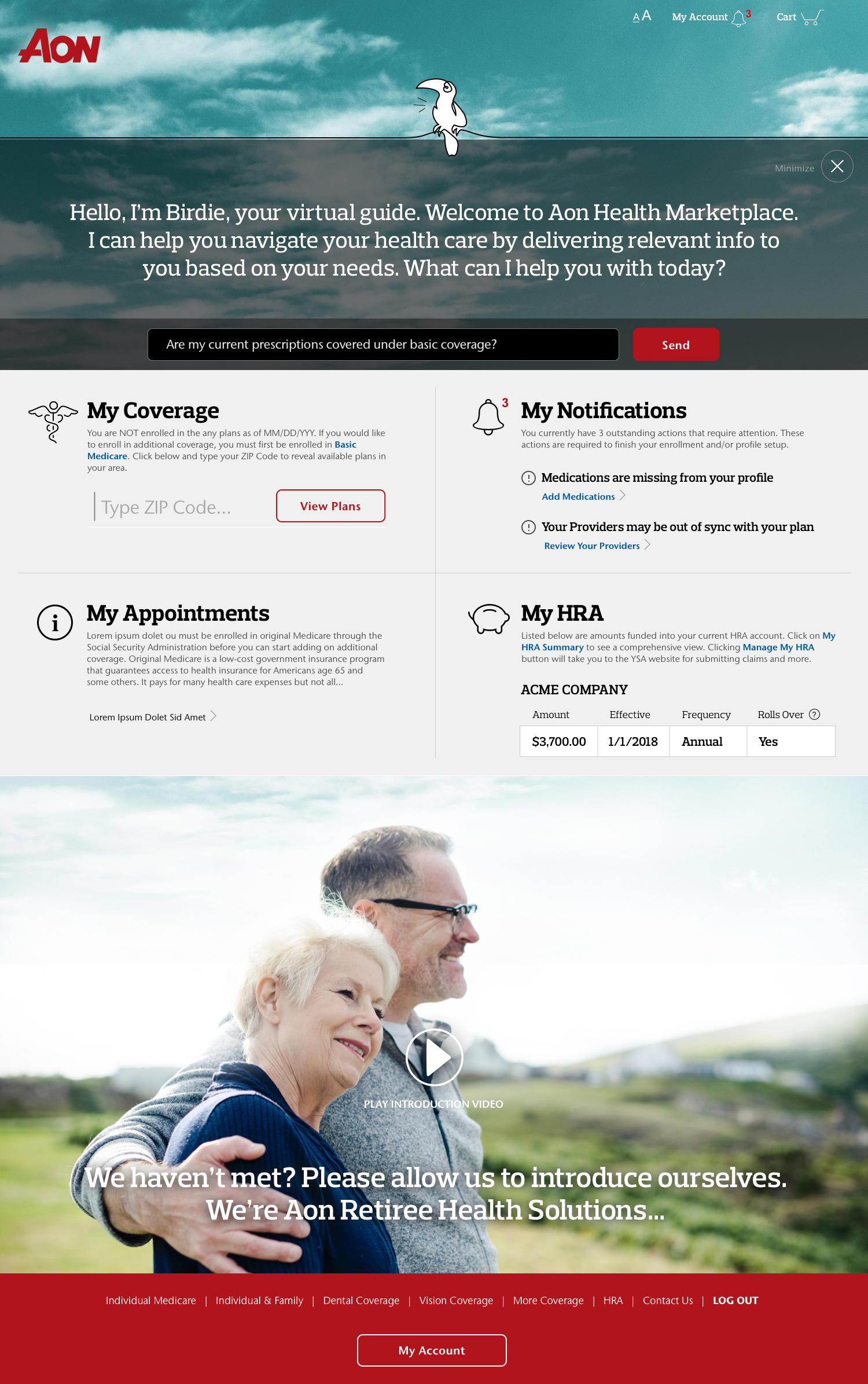
1. Provide a beautiful, simple, and actionable layout featuring users' current coverage and HRA status (when applicable).
2. Surface relevant, time sensitive actions and critical information to empower self-service with plan status, answering questions, managing problems, while consequently reducing customer support requests.
A central theme - modular and dynamic core components - began to develop throughout discussions and sketch iterations. You can identify them in the center areas of the sketches below. As we honed our focus, I produced the final concepts. The single selection was to be the basis of our approach. It would be what I mocked up next and tested early.
Presenting the right information at the right time was essential, but our users were looking for something more personal. The actions they take and the decisions they make on our platform are BIG for them. There needed to be trust. Trust we knew their needs or pain points, trust in our product and ultimately trust in us. Trust we knew how they felt during their engagement. I constantly tracked back to our user data for confirmation I was staying true to their needs. Just knowing a product can be more intuitive, more enjoyable, more beautiful is what drives me day in and day out! Plus, having parents that fell right into our core target audience, made it easy for me to channel empathy. All I had to do was to visualize them using our product.
"I'm old! I didn't grow up with this internet thing. I don't know how to do things on your website and I'm afraid to try. But I have no other choice!" – Marketplace user
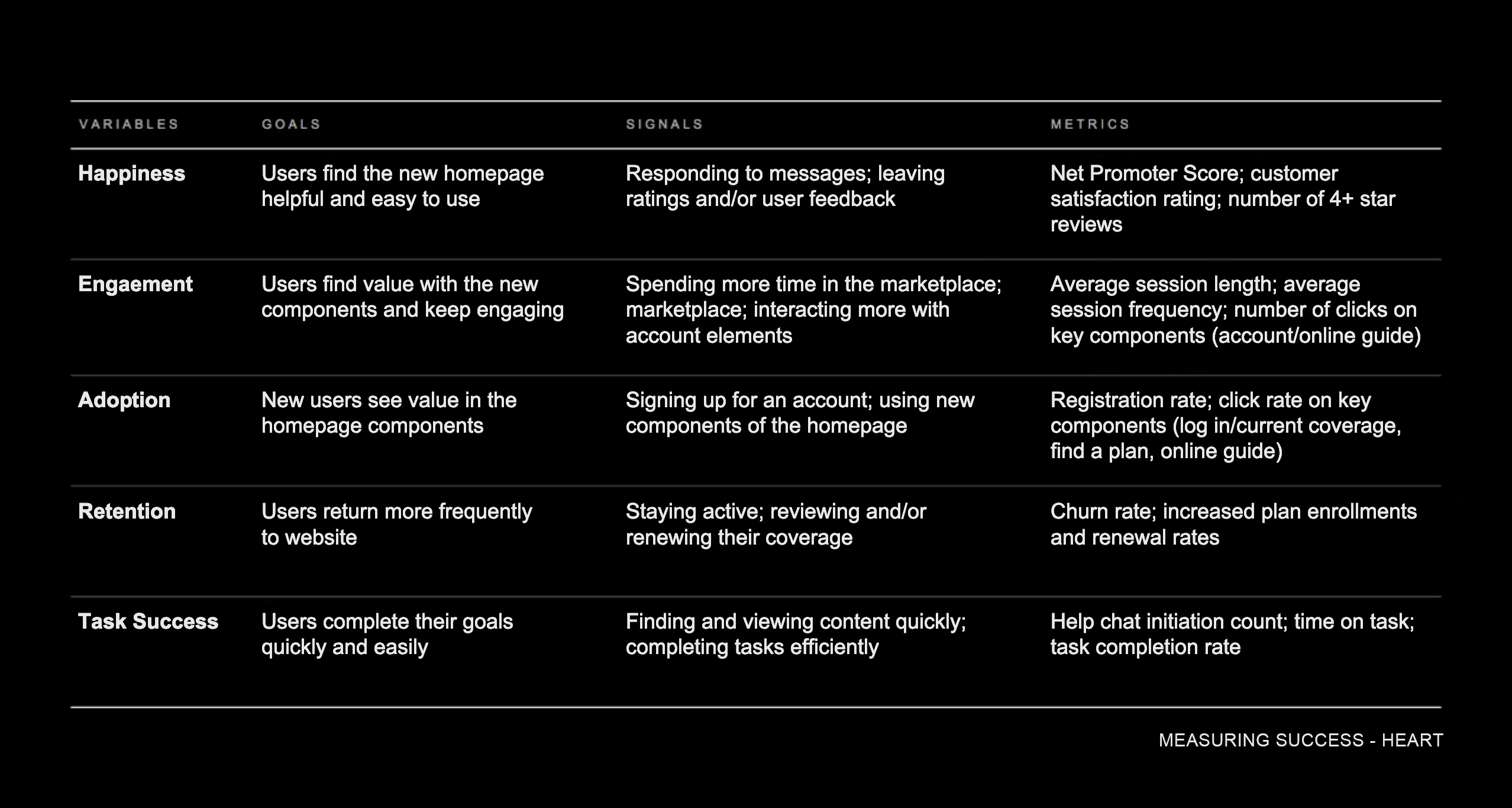
There are many ways to measure design changes to determine whether they meet the intended goals. To help gauge our success, I settled on a series of user-centered metrics that allowed me to measure the changes we were intending. These metrics are defined as HEART – happiness, engagement, adoption, retention and task success. This framework is useful because it’s simple and easy to understand. It makes communicating the reasons for the whys easy across the team and across the organization.
We were making good progress but who could have anticipated what would come next?
1a.Pivot
We need help.
For me, diligence is about doing the necessary grunt work and never resorting to shortcuts or half measures and giving it your all. Midway through the project, I was thrown a wrench - the leadership team directed us to append our work and add a new personalized help element. Adaptability would now be required more than anything.
Early in my role, I took the initiative to acquire approvals for the roll out new platforms and tools to help me gain user insights. At this stage of project, it became a double-edged sword. For the first time, the ELT had some visibility into our users actions and intents. However, they were ill-prepared to effectively deal with the data load and often had a knee-jerk reaction to various inputs. One of those came as a desire to create a more contextually relevant and personalized help or education experience within the product. I recommended we put it in our backlog and stay focused. I was overruled. Think of it like a questionnaire or test that captures the users' level of knowledge and makes personal recommendations, I was told. So I got to brainstorming. Again.
I thought big. I drew inspiration from conversational experiences gaining popularity and adoption. What if we integrated a voice-like assistant - not your typical rules-based chat - I pondered? After a flurry of sketches, I honed in on a concept and rapidly iterated on it.
I imagined a more integrated experience instead of a standalone section within the product - which was suggested from the onset. By integrating this element into the overall product experience, we could have it "follow" the user along their journey. Ultimately, it would deliver them to their intended goal. With this part of the challenge I also explored the concept of personalizing or naming. After research was done on our core demographic, we agreed on Lisa. As it turned out, this would evolve as well.
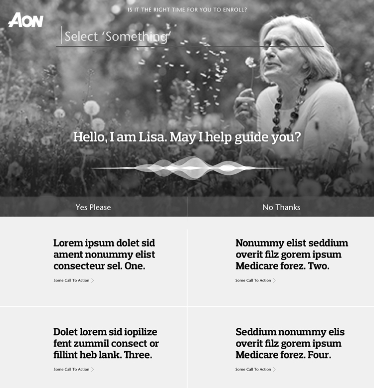
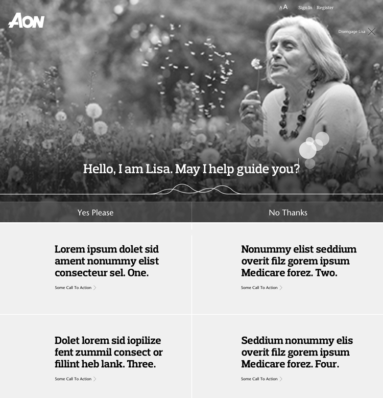
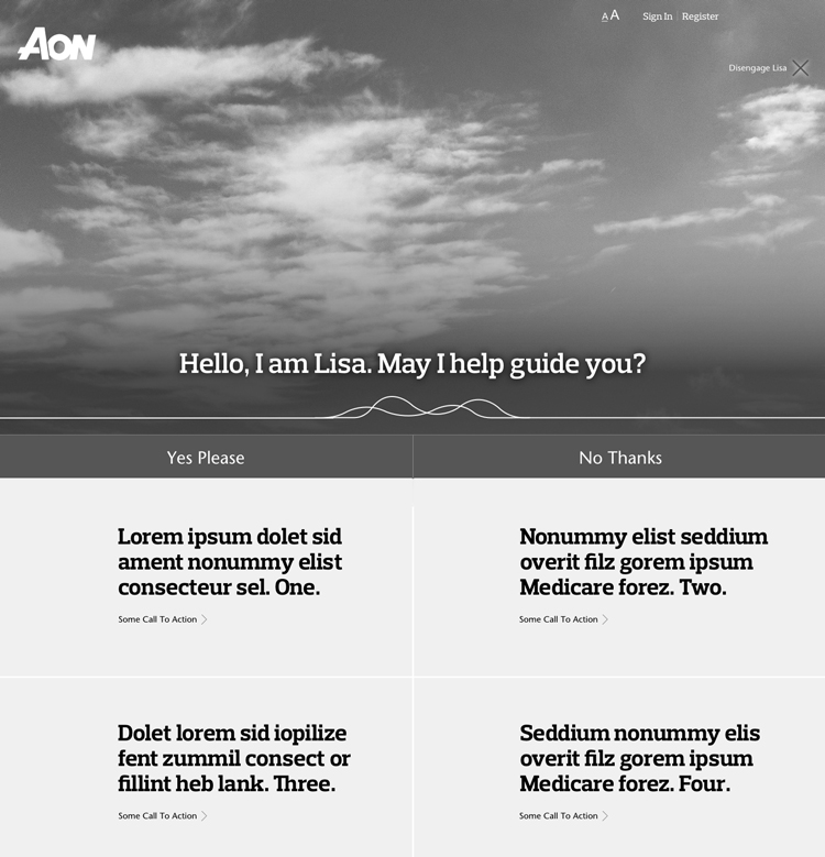
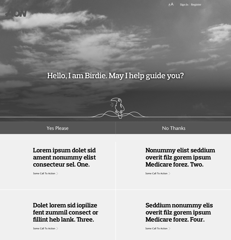
As time and technical constraints surfaced, I scaled back my initial concept. Our MVP of this additional feature would now be a simplified interactive component which would identify our users' knowledge base and guide them on an associated journey. I established a (future) iterative path for which we could eventually realized its' full potential.
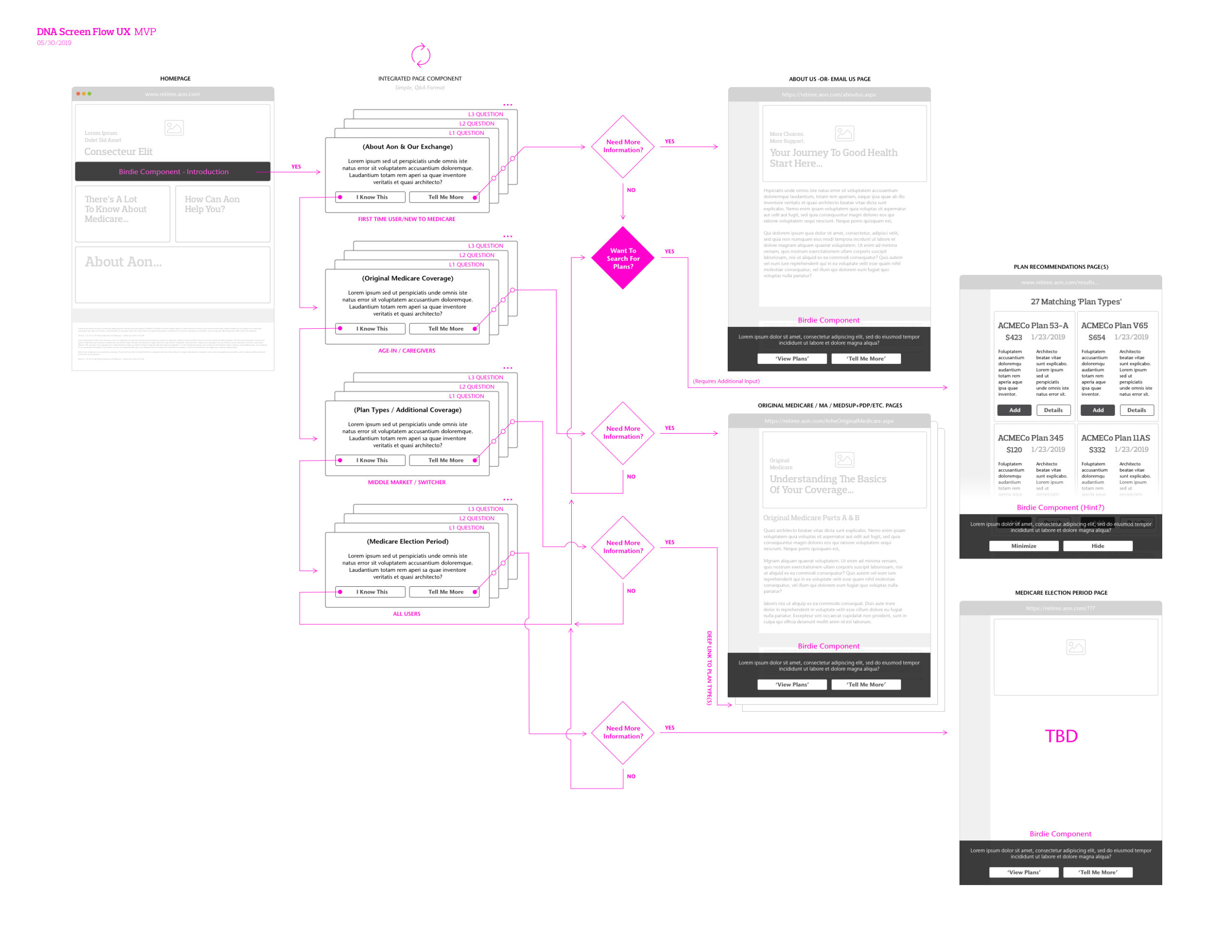
I began to increase the fidelity of my designs incrementally. For my high fidelity mocks I utilized the newly crafted (and constantly evolving) Design System Library that I had created much earlier in Sketch. It allowed me to output a series of unique layouts utilizing new modular components - dynamic in nature. Based on a particular type of user, the arrangement and display could vary. Additionally, upon log-in, the components would allow for snapshots of relevant user information potentially removing the need to navigate deeper.
2.Validate
Testing 1, 2, 3.
Throughout, it's crucial to have reviewers who are candid and have a good sense of taste and for designers to have the capacity to openly receive feedback. The most valuable feedback can sometimes feel critical. It's imperative to leave personal feelings and ego at the door and to consider these suggestions - even if they completely re-direct the work.
Up to now, my approach was based on our assumptions - which might have missed crucial information or suffer from bias despite being backed by research (and empathy). Given a somewhat lackluster participation from the full team, testing would allow me to gain valuable feedback from real users. User testing served to validate my design approach. Users were brought in to interact with the prototype. Notes were taken and reactions recorded. My testing suggested I revisit and challenge some of our previous understandings which led to more iterations.
Prototyping is relatively cheap to do and can be quick to create, making it a cost-effective method to validate and improve the user experience within the feedback loop. It can also help surface the difference between what users say they will do and what they actually do.
Building a click-through prototype allowed me to test my approach and gain feedback from some of our actual users. This feedback triggered iterations and re-testing, as it enhanced my understanding of our users. There are some simple benefits of this iterative design approach beyond its cost-effectiveness: It allows for rapid resolution of potential misunderstandings while establishing clarity early in the development lifecycle; it brings out user feedback to ensure that system requirements meet user needs; It gives stakeholders better visibility of progress at each iteration.; It gives the development team some certainty that their efforts will not be squandered and it allows for easy incorporation of “lessons learned” along the way.
One of the most challenging skills of a designer is creative selection. This runs throughout the lifecycle of any project. It boils down to knowing when to say no. It's about trusting your gut and experience. It's about having great taste and always striving to refine and improve it.
This was as true now, when distilling user feedback on design iterations, as it was at any point in my journey to create a more streamlined, meaningful and friction-less experience for our users.
3.Converge
Taking it home.
Empathy is trying to see the world from other people’s perspectives and creating work that fits into their lives and adapts to their needs. My job is to help them accomplish their goals in the most direct and delightful manner possible. This characteristic defines me. And it continues to be true as I work closely with engineers to help them extend the design vision into and through development and deployment.
After obtaining stakeholder consensus, polishing the design, content and user experience, it was time to ramp up development. To effectively develop and deploy the design vision, it was essential for me to collaborate closely with engineers by communicating clearly and openly, considering engineering constraints, and working together throughout the development process. I took into account engineering constraints as I navigated cross-cultural dynamics. Our engineers and I collaborated all along to ensure the design vision was feasible and that it would meet performance and reliability requirements. The near end of my work cycle saw me working with QA and other internal test groups to check for edge cases or bugs - as we attempted to drive bugs to as few as possible prior to deployment. In the age of nearly automatic software updates, it's easy to release buggy software because you can always update it later. Our users were much, much more averse to change as others. Therefore, we needed to get it as right as possible up front. We needed polish and refinement. We were already going to hit them with an entirely new experience upon their next log-in. We couldn't afford to have the new experience buggy.
With my unique approaches and unparalleled design knowledge within the organization, I was able to create new business opportunities while generating value for users.
For me, work is a quest for knowledge and understanding fueled by insatiable curiosity. I feel the same can be said about life to some degree. As my curiosity never ends, neither does my learning.
As usual, I learned a lot. I learned that designing and solving problems for the ones who need to use digital tools, but lack the capacity to do so, is incredibly rewarding. This was reflected in my work here. As a designer who had no prior background in Medicare, all I needed was empathy, curiosity, taste and constant iteration to design an experience that can get our users motivated in the selection and management of their healthcare. With these elements, I've learned I can create meaningful relationships with your users that can ultimately shape our product into a boundary-breaking competitor and a market maker. The team learned a lot. As proclaimed by them, they learned the importance and value of process with their full participation in it early and throughout. I believe the organization learned a lot - that with effort, a lot of effort, they just might become more design-centered and user-obsessed as I am.
Healthcare interfaces are not typically honored for their visual appeal or aesthetic qualities. They’re often terribly clunky - years behind current design trends. I saw this as an opportunity to bring beautiful design to an industry where there is a void. I have to admit, there's a level of satisfaction taking an antiquated design and revolutionizing it as I did with this one.
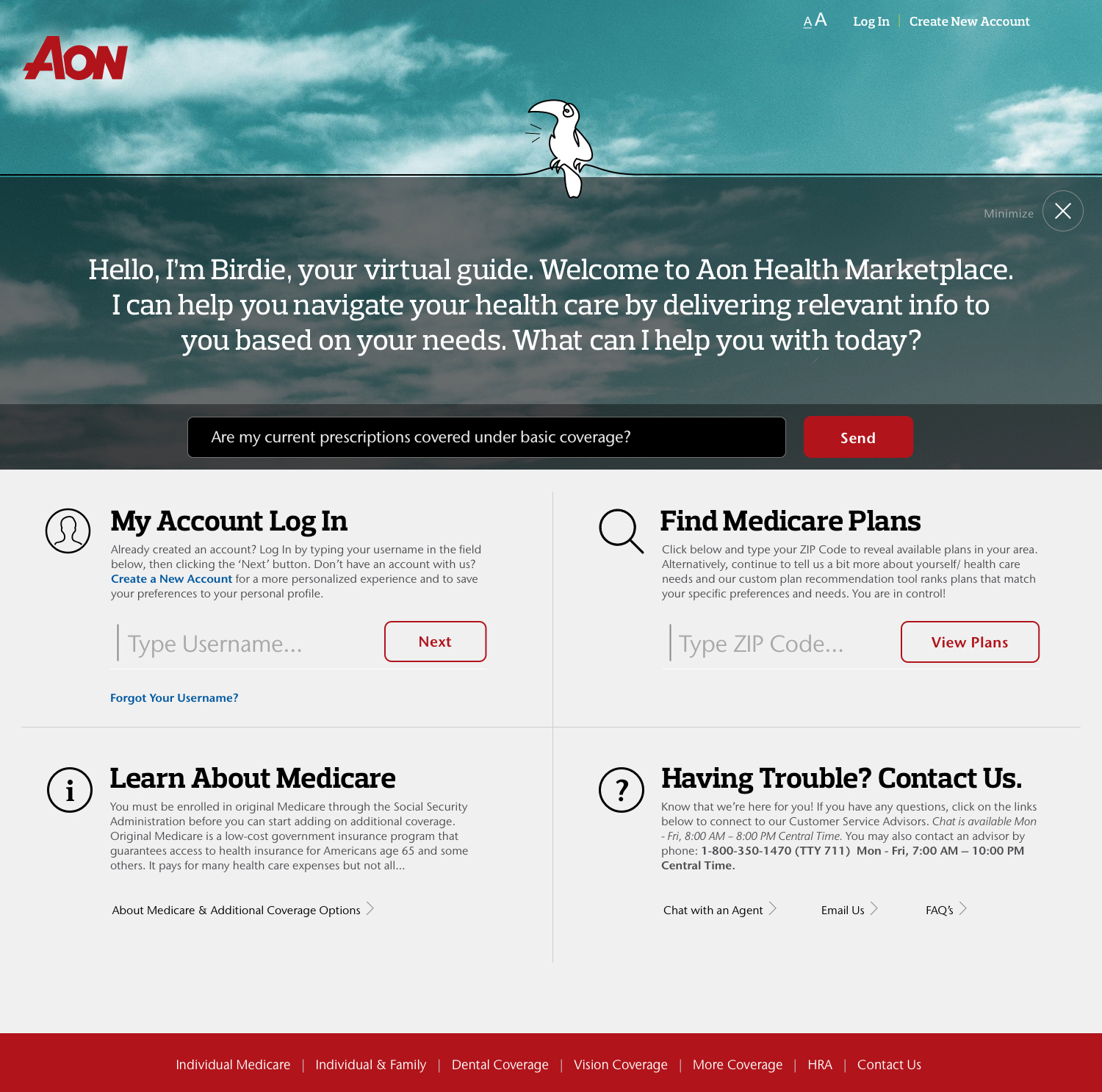
Introducing the new Medicare Marketplace Experience
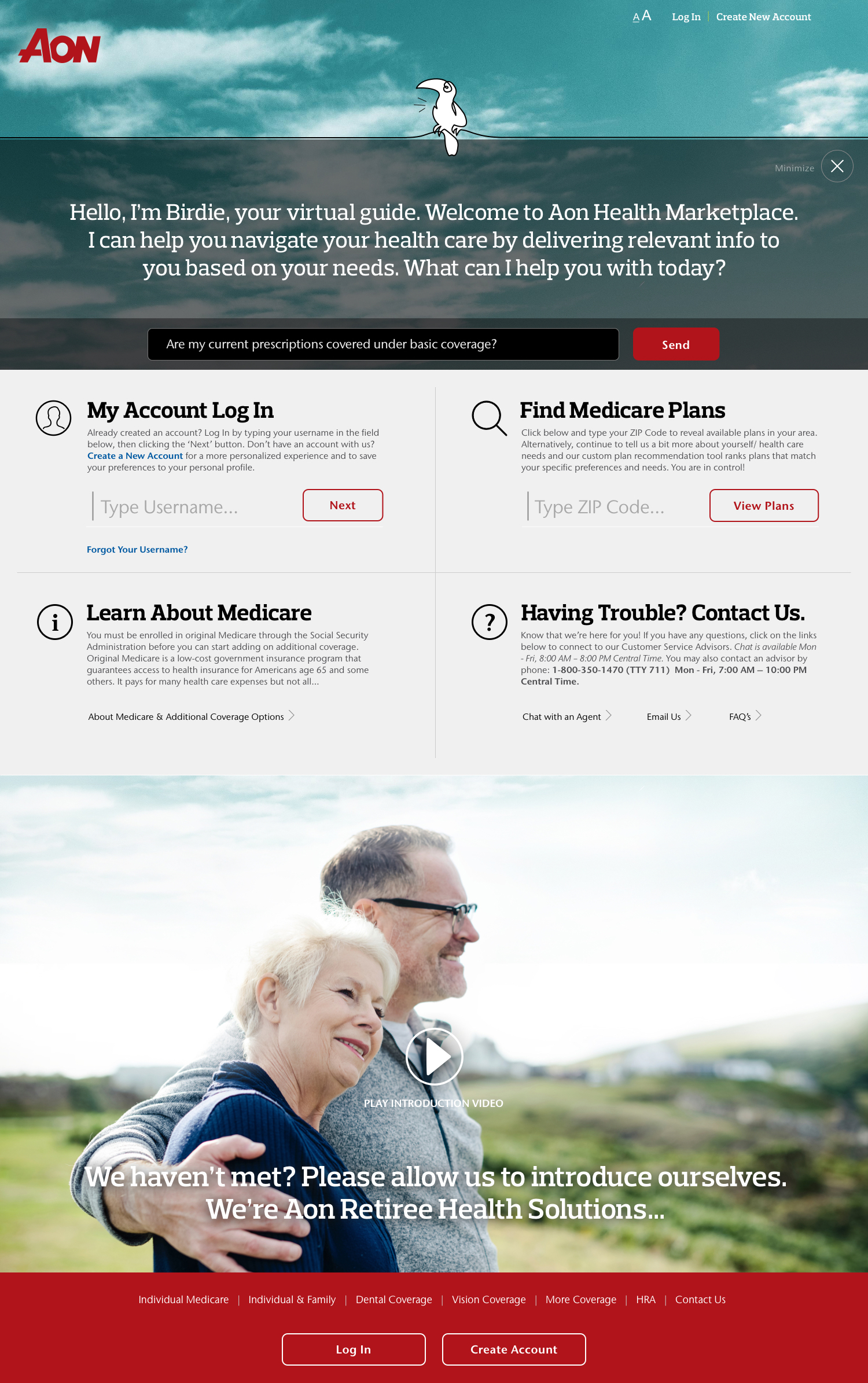
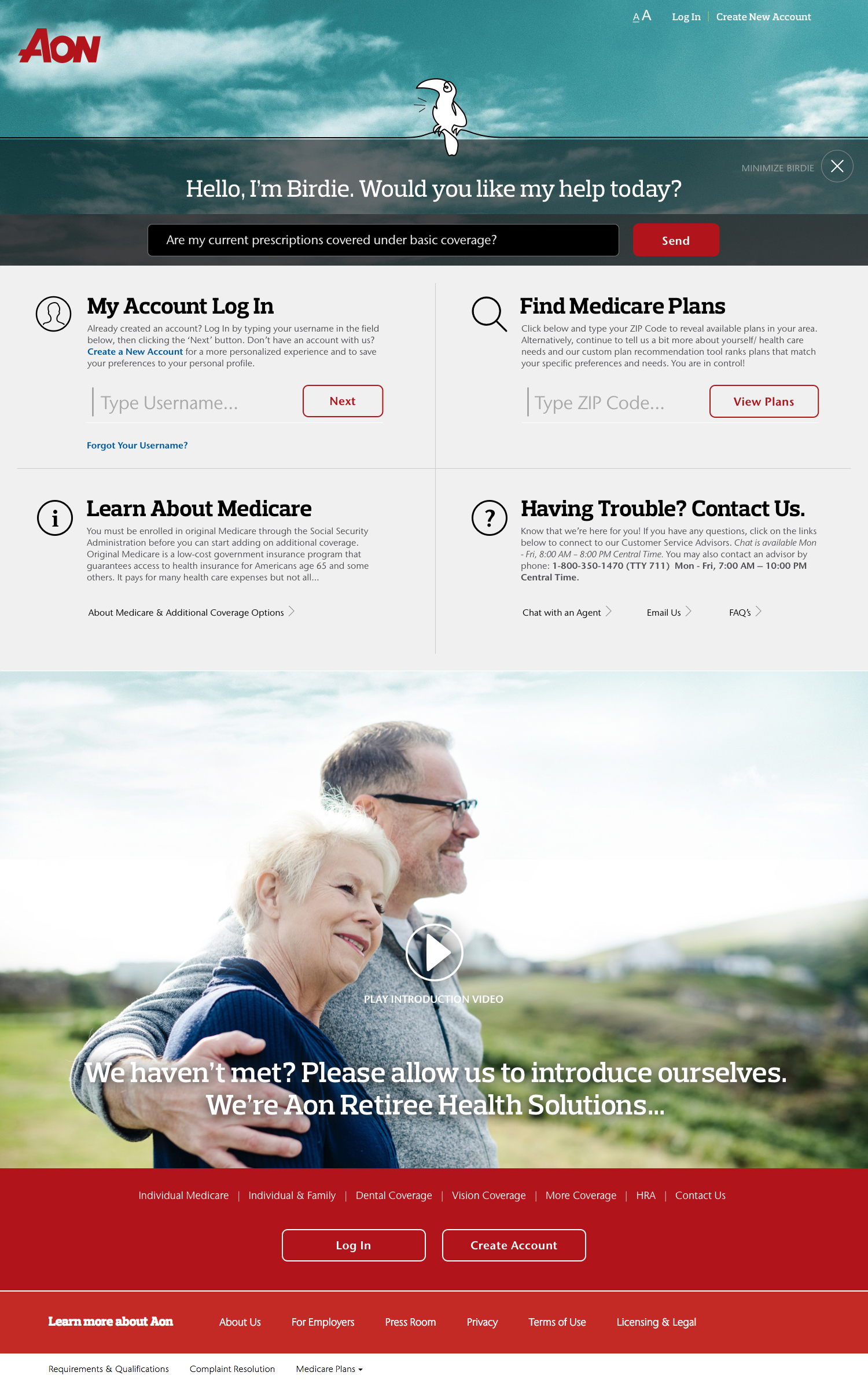
Healthcare Marketplace
This case study recounts the captivating journey of my efforts to craft a more intuitive and visually pleasing medical plan shopping experience for our ~53,000+ daily active users. I was tasked with bringing a level of design & UX sophistication to the product never seen before within the group. In an entirely hands-on role, I conceived and designed all elements featured here as I collaborated with three Product Managers, two FEDs and a team of BEDs spread across three different Scrum teams.
ClientAonServicesResearch, Ideation, Prototyping, Visual & Interaction DesignYear2022Linkretiree.aon.com