Augmented Reality Low-Code Editor | Case Study
Stand in. Stand out.
Completely re-designed with a stunning new face and intuitive enhancements, this beauty enables you to stand in as an Augmented Reality authoring pro with ease. It'll keep you producing — all day and into the night shift. Now featuring a clean, professional and minimalist aesthetic, this release is nothing short of stunning. Creating and publishing captivating AR scenes and workflows has never been more appealing.
Before. After. Breathtaking.
Lay of the land.
Scene 1. Take 1.
With a HQ located in LA Center Studios, it only seems fitting that I use a film metaphor to tell the story of my stint 'on set' at this start-up. My responsibilities catered to the demands of this rapidly evolving company as I crafted endless creative solutions for seemingly random requests, shrouded in ambiguity, from a revolving door of 'cast members'. Could even Hollywood write a more titillating, drama-filled, roller coaster of a rags-to-riches-to-rags story?
Possibly. However, this is not a work of fiction. The following story line is true with most names redacted. It's not meant to sound disparaging whatsoever. Rather, it's an accurate portrayal of the environment for which I entered and despite a vast assortment of unique challenges, I still thrived, flourished and delivered. That is to say, until the money ran out. Action! The scene opens with a shot of the 4D Studio® product on a users' screen, with a maintenance page overlaid. The camera then pans out to reveal a bustling office in Mountain View, with workers sitting at their desks, feverishly working away on their computers. A voice over begins: "Here at Daqri, we're dedicated to bringing Augmented Reality to the industrial sector. Our team of designers, engineers and scientists work tirelessly to make sure our publishing platform is state of the art. This is in bated anticipation of the launch of our proprietary hardware that will ingest and display the published content in AR.", said the CEO. But hold on, let's save that last part for the next case study. The camera cuts to a shot of the lead designer, a front-end engineer and the product owner sitting at a table, sipping on their morning coffee. They look up and turn to face the viewer. One of them speaks: "Unfortunately, due to the CEO's desire to merge our products and now focus on the industrial space, we're going to need to completely re-design the entire user interface. Please bear with us and check back soon for access to our platform." The scene ends with a close-up of the 4D Studio logo, with the words "Augmenting Reality." superimposed over it.
The bad. The bad. The ugly.
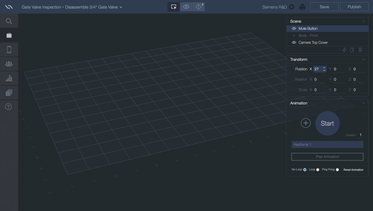
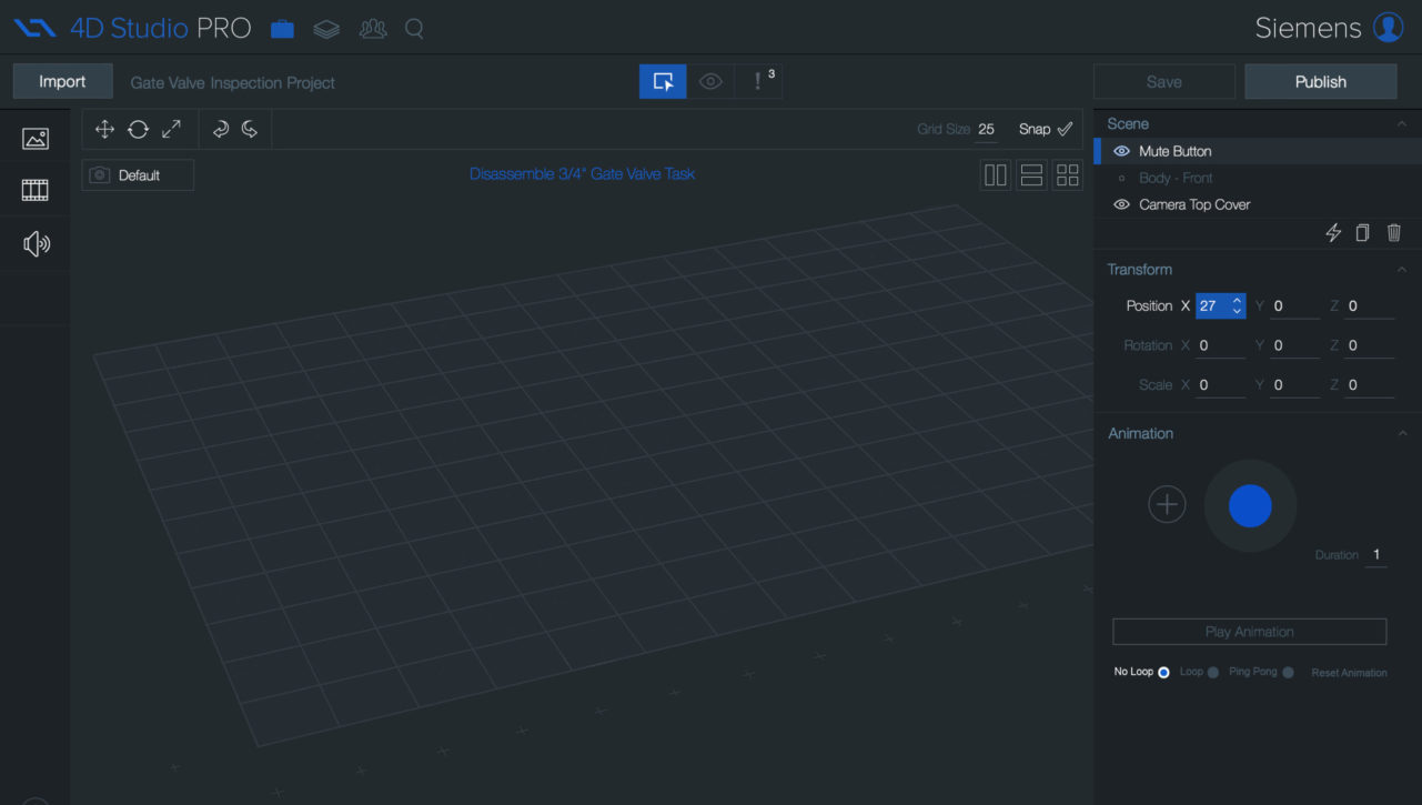
Fragmented Source Files
The existing design had been created by two different contractors, working independently across two different graphics applications. My expertise at consolidating the strengths of each effort resulted in a new and uniformed path forward.
No Responsive Layouts
The current state of the product was a static design that did not emulate modern web applications. There was no development in place of flexible layouts. This had to change.
A Dated Design
The visual design of the product was dated. It lacked much of designs' best-practices that users had come to expect as seen on other robust web products.
26 Minutes
0.Challenge
Merge and elevate.
A few months in, our CEO asked me to execute a complete redesign of our flagship product – 4D Studio. Simultaneously, I was balancing requests from other stakeholders. At this point in the story, our company started to undergo rapid growth and change. People were coming and going while our company's focus was evolving. On any given day, I could walk into work and discover I had a new directive. Change was the norm. It was crazy. It was exciting. I was in my comfort zone!
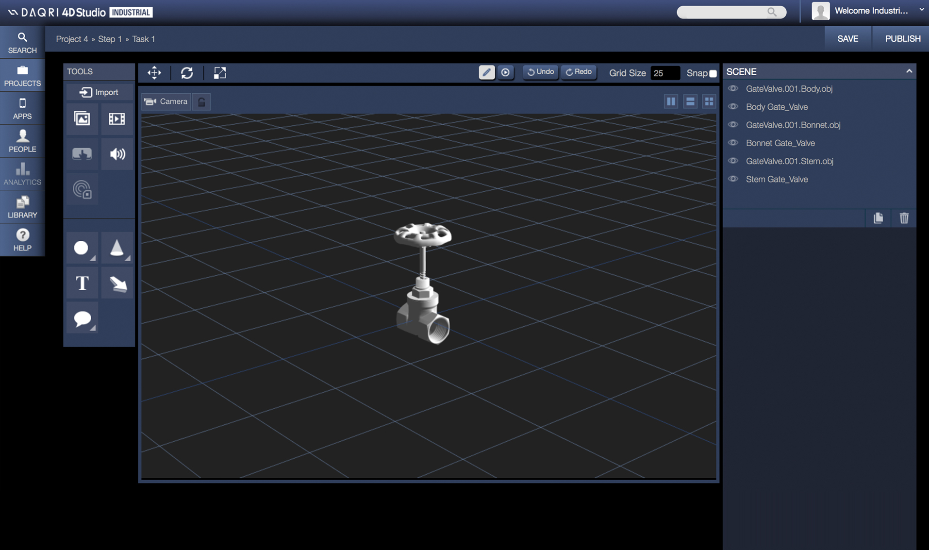
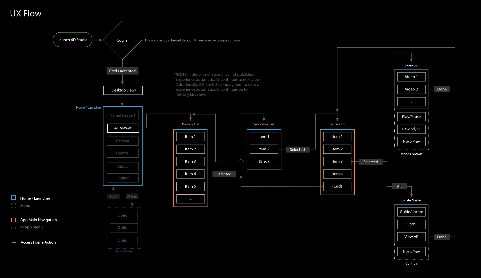
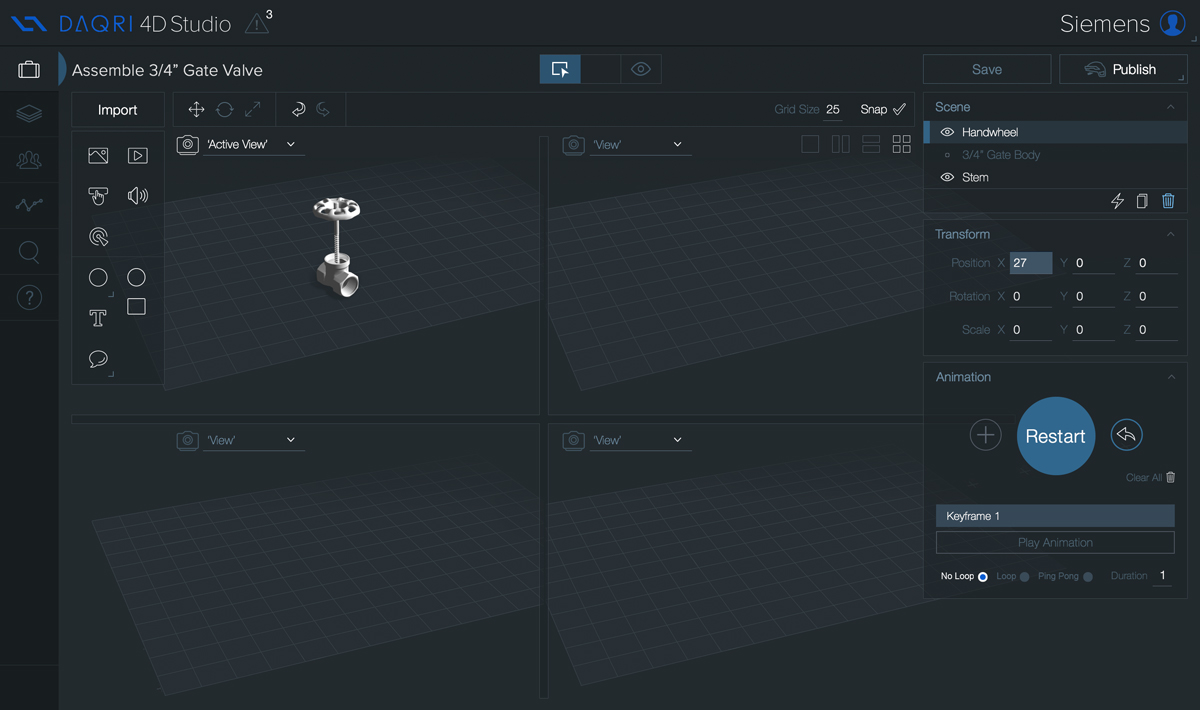
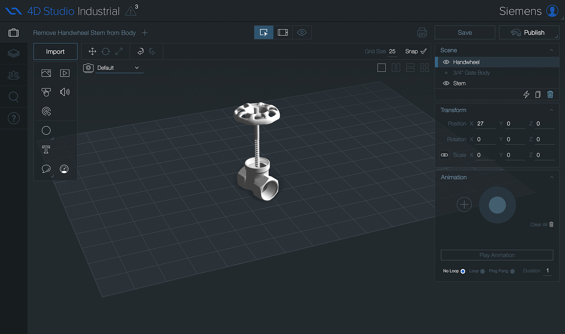
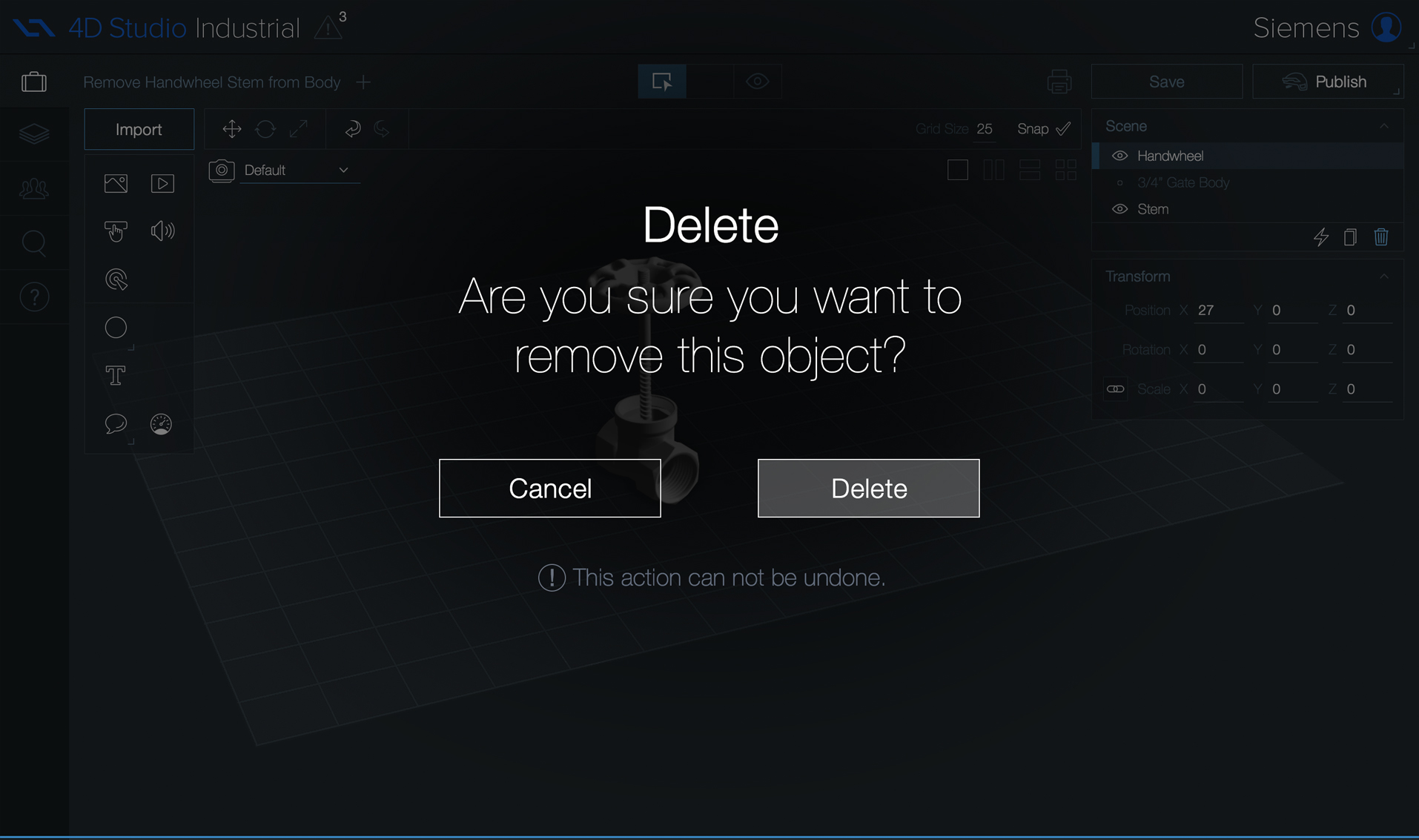
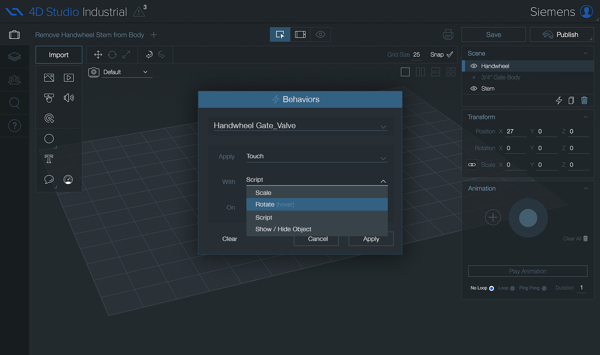
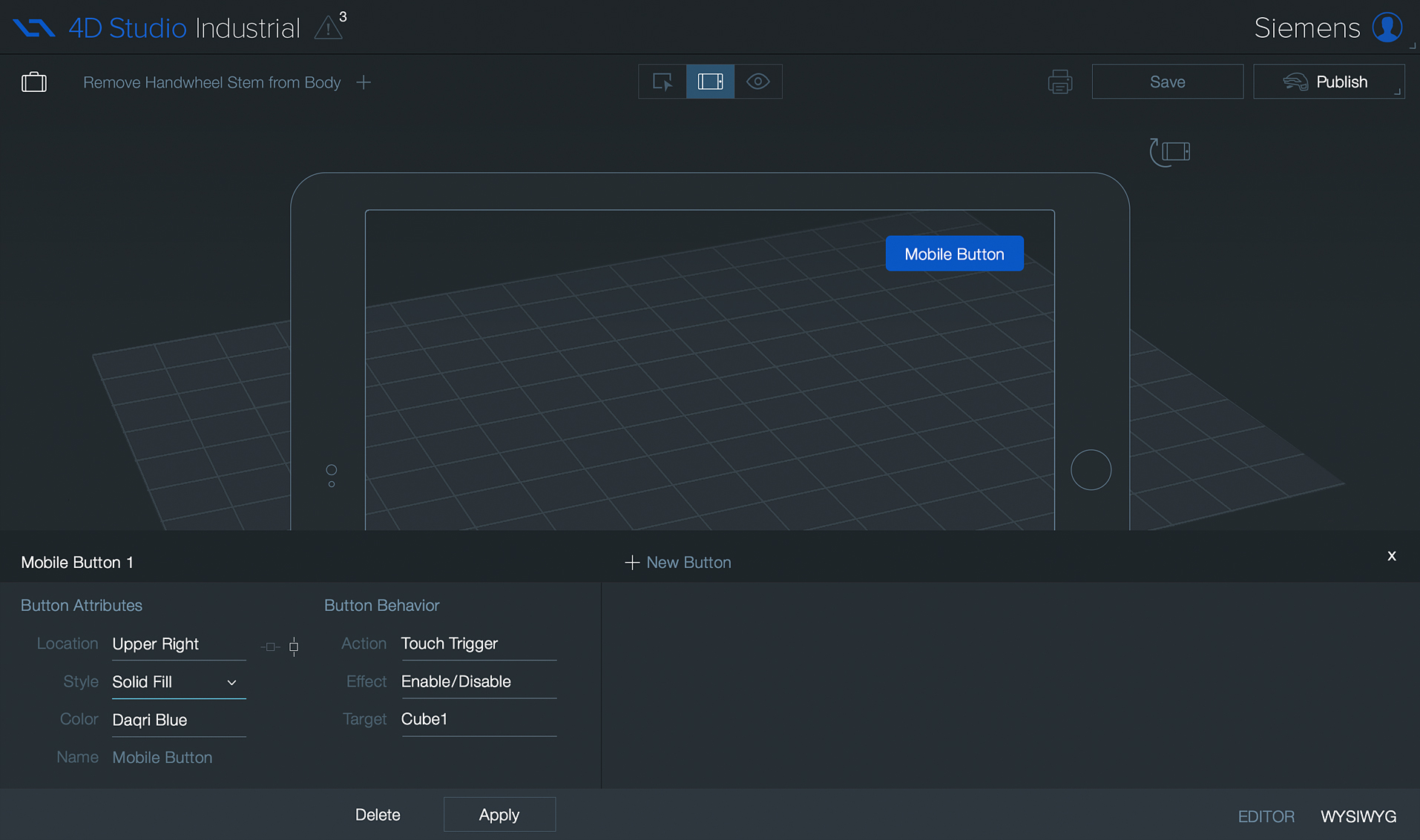
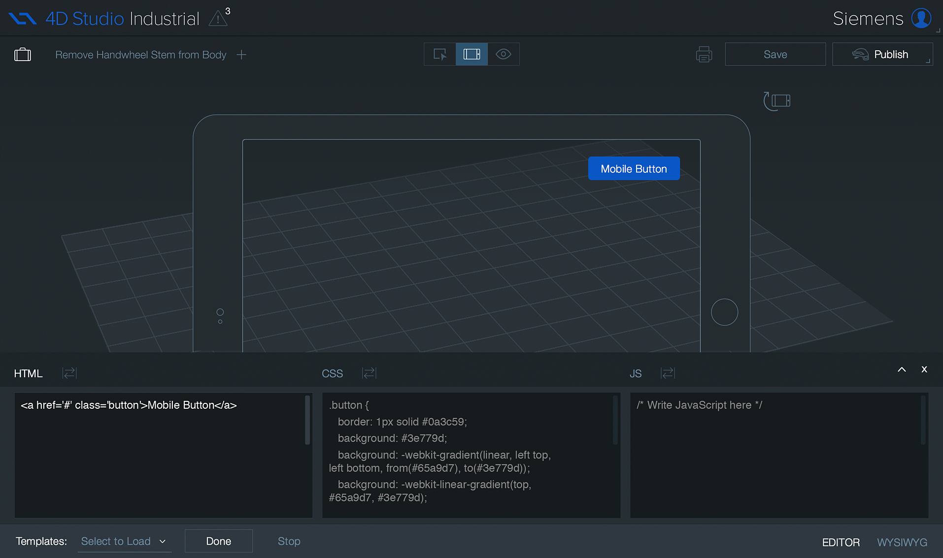
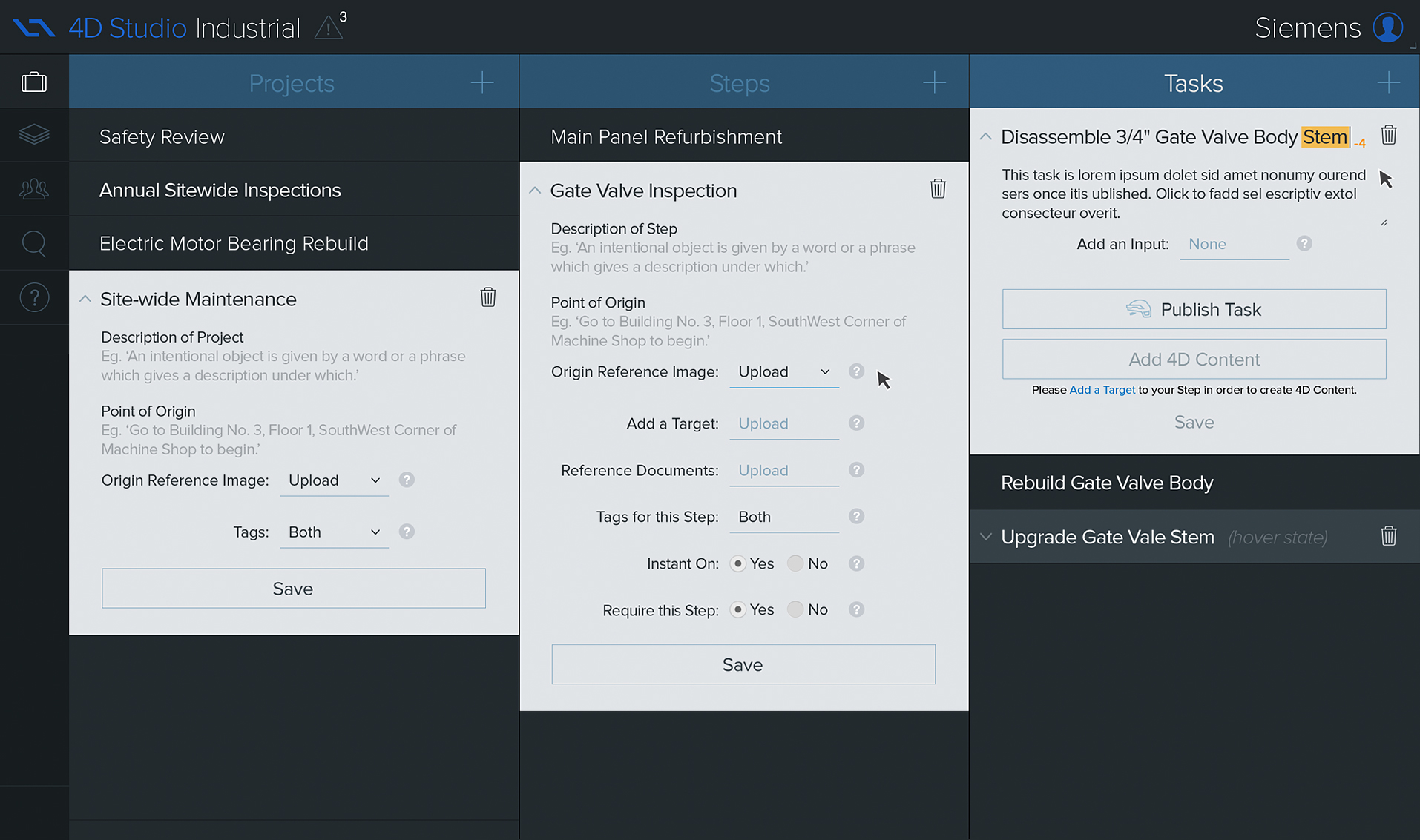
The leading value of augmented reality is the manner in which components of the digital world blend into a person's perception of the real world, through the integration of immersive sensations, which are perceived as natural parts of an environment. Experiences are seamlessly interwoven with the physical world such that it is perceived as an immersive aspect of the real environment. In this way, augmented reality alters one's ongoing perception of a real-world environment. This aspect of natural blending would become the basis of my primary design principle – the vision or purpose – driving my work. 4D Studio® is an enterprise software suite that allows planners and engineers to create and publish their own AR scenes, work instructions and workflows to mobile applications. The authoring interface consists of two core screens. The first allows the user to set up their project with steps and tasks. After a project is structured, the user is taken to the editor or authoring view. Similar to other software, the user is able to build elements, upload 3D models and integrate real-world physical sensors. Armed with a laser-focused understanding of the why and what, I began to ideate.
1.Ideate
Dark is the new black.
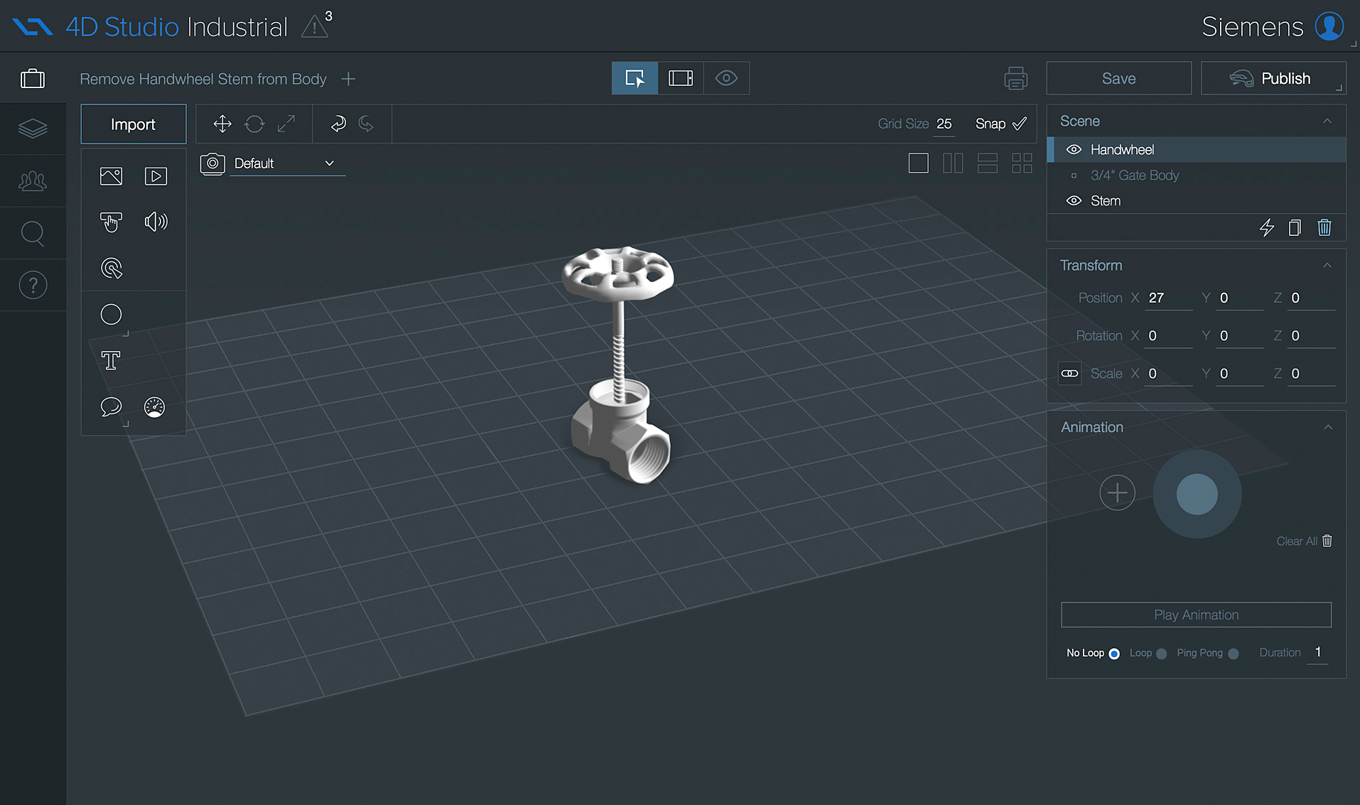
My intention from the start was to have the design direction draw inspiration from the Augmented Reality end-user experience. Through the use of transparencies, overlays and subtle design color cues in the UI, the user's engagement would be on the AR scene they were designing, not the software’s UI.
Our initial team was primarily comprised of myself, a Product Owner, a Front End Dev, three Back End Devs and one QA. I was charged with owning the end to end Product Design – inclusive of conceptual, visual, interaction, research and testing. We were small. We were scrappy. As a starting point, I inherited two different designs – consumer and industrial – that had been created by two part-time contractors. One had been working in Adobe Photoshop and the other in Illustrator. The design style was scattered across numerous disparate iterations with no unified look or design system library in place. Fortunately, I tend to thrive in ambiguity. We began our work by me pitching my vision and after a series of creative sessions we settled in on the direction. My overall approach would allow for the UI to fade into the background, thus floating the authored content up, taking center stage. From the two existing product versions, I entertained a variety of visual explorations, initially employing a general flattening to the skeuomorphic styles and moving forward with a the muted and eventual semi-transparent style. The color palette was simple, dark and professional. Multiple subtle variants of the finalized version were created, compared and contrasted and ultimately presented for approval. After a trip down to LA and a private pitch to the CEO – later the broader executive team – we had a winner.
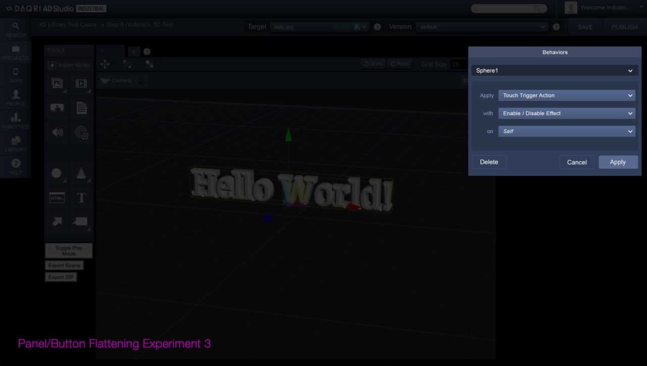
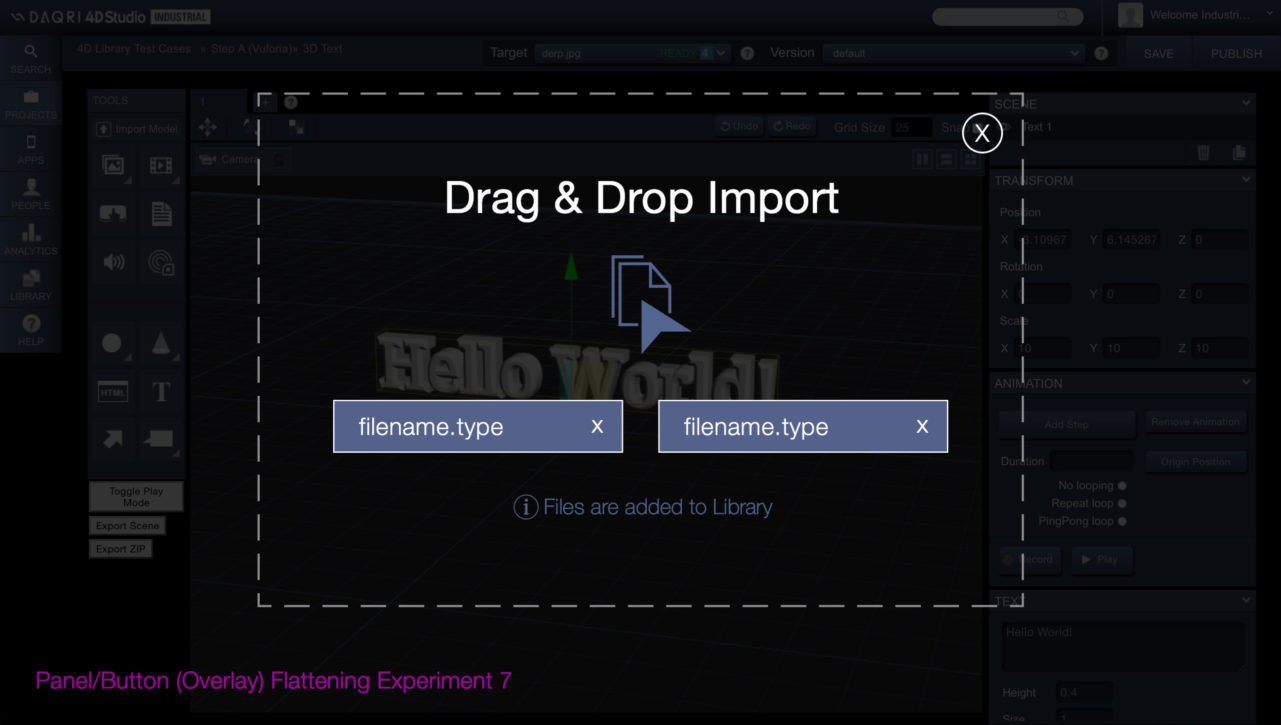

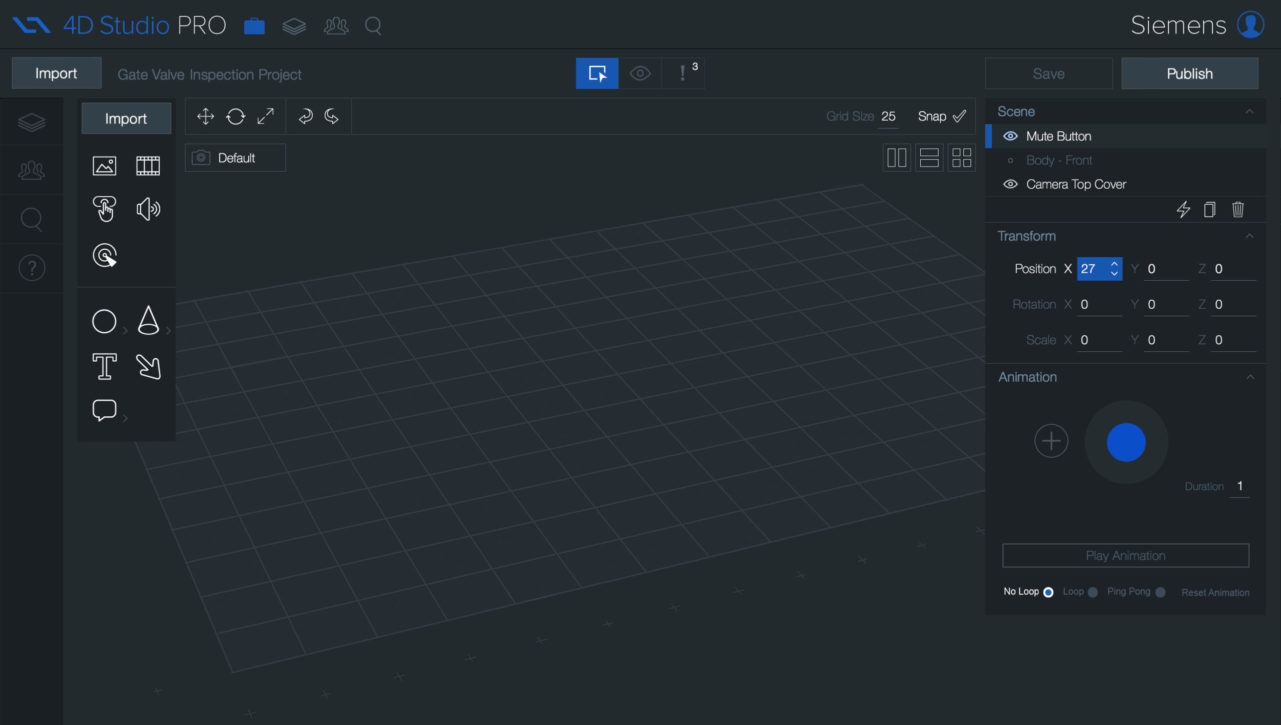
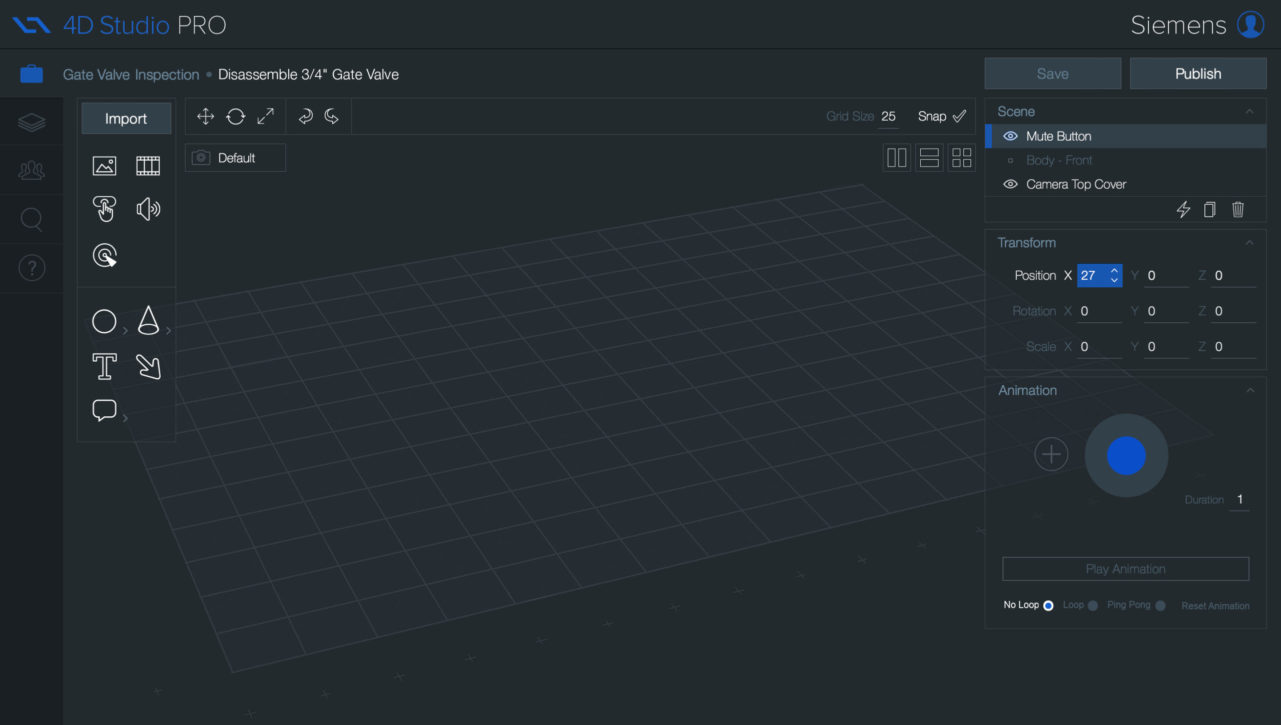
By intentionally utilizing AR-inspired transparencies, overlays and subtle design color cues in the UI, I was able to serve user's needs and maintain consistency – equally allowing for the UI to fade into the background. By coalescing around a primarily monochromatic scheme with an injection of our company’s brand color for focusing the user's attention, the end result was serious yet approachable. Upon establishing the style for the editor, I moved onto rolling it out across the workflow template and all associated views. Through close collaboration between myself and the devs, we were able to integrate the re-design and deploy it to our user base. Shortly afterwards, I was fortunate enough to interview a handful of our users to get a better sense of the impact. Although the responses weren't truly qualitative, they were encouraging.
"With it's brand new look and feel, it's so easy to use. I love how the panels are somewhat transparent and appear to fade away, allowing me to focus on my scene and content creation!"
– Site Manager
Throughout, I created, deployed and evolved a Design System Library from this work, eventually containing all elements and components as a single “Source of Truth". From this we would have a common language to speak and a uniform style to guide us as we moved into the design of our proprietary suite of mobile applications. The color palette was established. Iconography was in place. Things were really beginning to look up!
1a.Enter
Chief Executive 'User'.
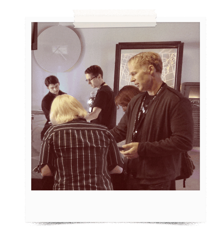
I believe diligence is about doing the necessary grunt work and never resorting to shortcuts or half measures – giving it your all. To help determine what our users pain points were, for the user experience enhancements, I needed to observe actual users – although this was counter to our CEO's beliefs. But first, I needed access to them. Crashing the AR World Expo at our headquarters to observe them in the wild is where our story takes us next.
Scene 1. Take 2. Our initial goal had been successfully attained. 4D Studio® had emerged with a stunning new face. Our second directive was to identify and improve problem areas within the current user experience - all the while adding new features. As we started this next phase of work, I knew I needed to observe and interview our users to better understand their needs. Learning comes from not only observing but talking to users to identify their real-world problems and pain points. Unfortunately, I had little support internally for user testing. I would simply need to get strategic. The target users of our software were known. We had a number of paying Fortune 500 clients. However, access to them was limited. I had to get creative in order to gather real data and distill it into actionable insights. Under these constraints, I used any opportunity to engage with users to get a concrete understanding of their needs and desires. On one occasion, I crashed our company's AR World Expo event at corporate headquarters and observed and interviewed every attendee that was willing. I made some important connections that would come back to serve me again – later in this story.
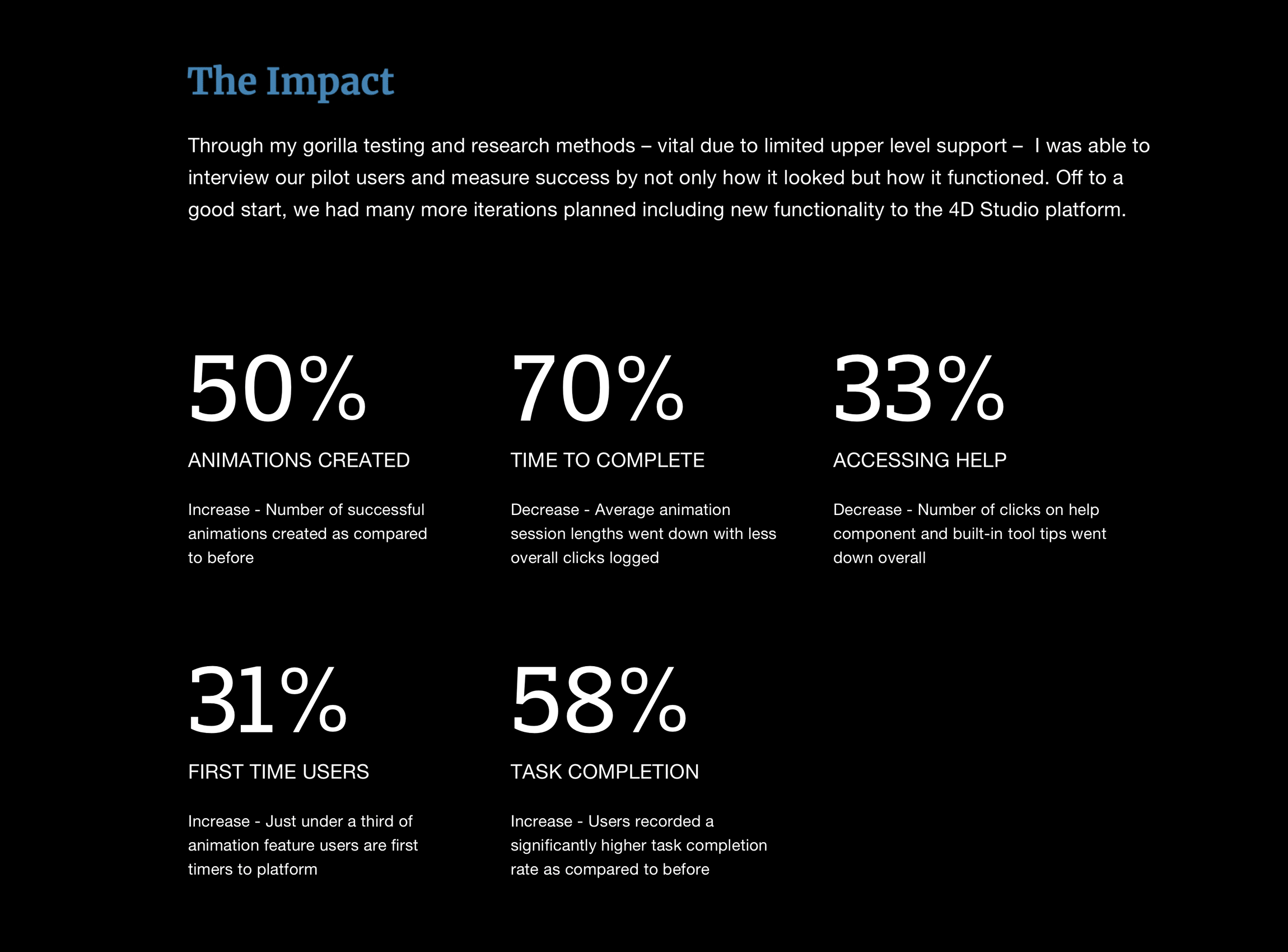
Armed with my newly acquired findings, I was able to return and use them to assist my decision making and adjust my assumptions. A few of my earlier hunches kept surfacing with our users – primarily animation was problematic. Now there are many ways to measure design changes to determine whether they meet the intended goals. But what cues and metrics would I use to determine I reached my goal upon completion? To help gauge our success, I settled on a series of user-centered metrics that allowed me to measure the changes we were intending.
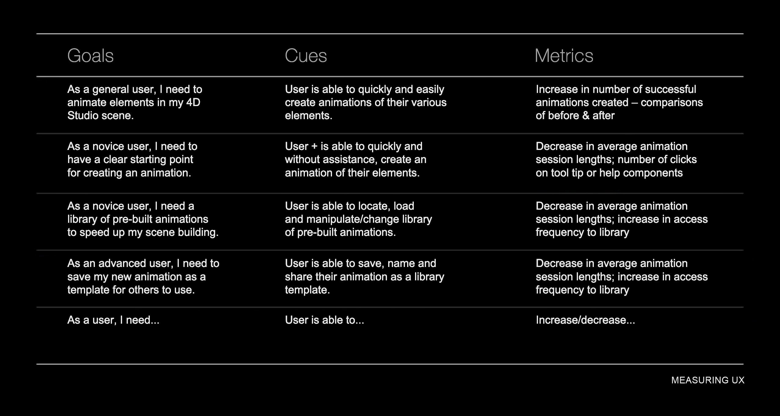
By synthesizing user feedback from my gorilla research, I had a lens through which I could identify problematic areas and measure success by not only how it looked but how it functioned. Emotional design is one thing, intuitive user experience is yet another.
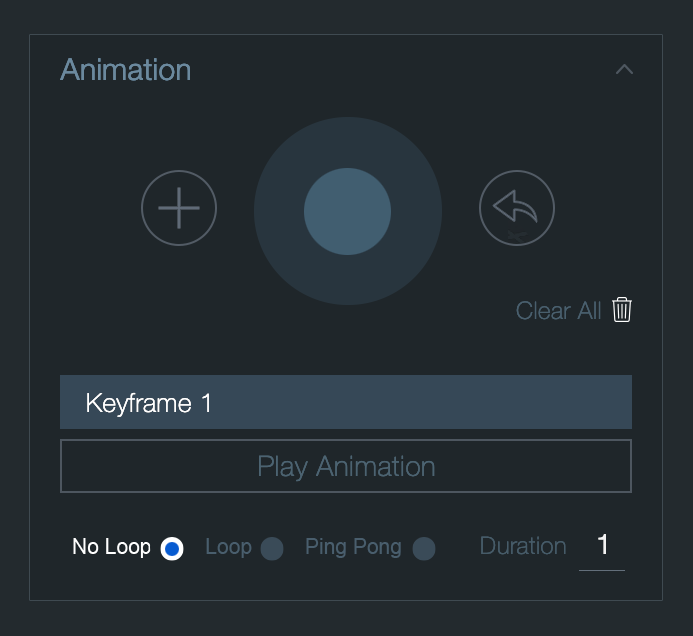
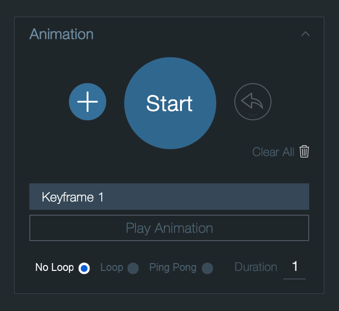
I focused on foundational user journeys. The core flows that users engaged in to accomplish their main goals. Our animation component was one of those. Intuitively, I knew there were usability issues. Testing our existing implementation and my new concepts revealed the pain points.
2.Validate
Fingers meet paper.
Throughout, it's crucial to have reviewers who are candid and have a good sense of taste and for designers to have the capacity to openly receive feedback. The most valuable feedback can sometimes feel critical. It's imperative to leave personal feelings and ego at the door and to consider these suggestions - even if they completely re-direct the work.
Up to now, my approach was based on our assumptions - which might have missed crucial information or suffer from bias despite being backed by research (and empathy). Given a somewhat lackluster participation from the full team, testing would allow me to gain valuable feedback from real users. User testing served to validate my design approach. Users were brought in to interact with the prototype. Notes were taken and reactions recorded. My testing suggested I revisit and challenge some of our previous understandings which led to more iterations.
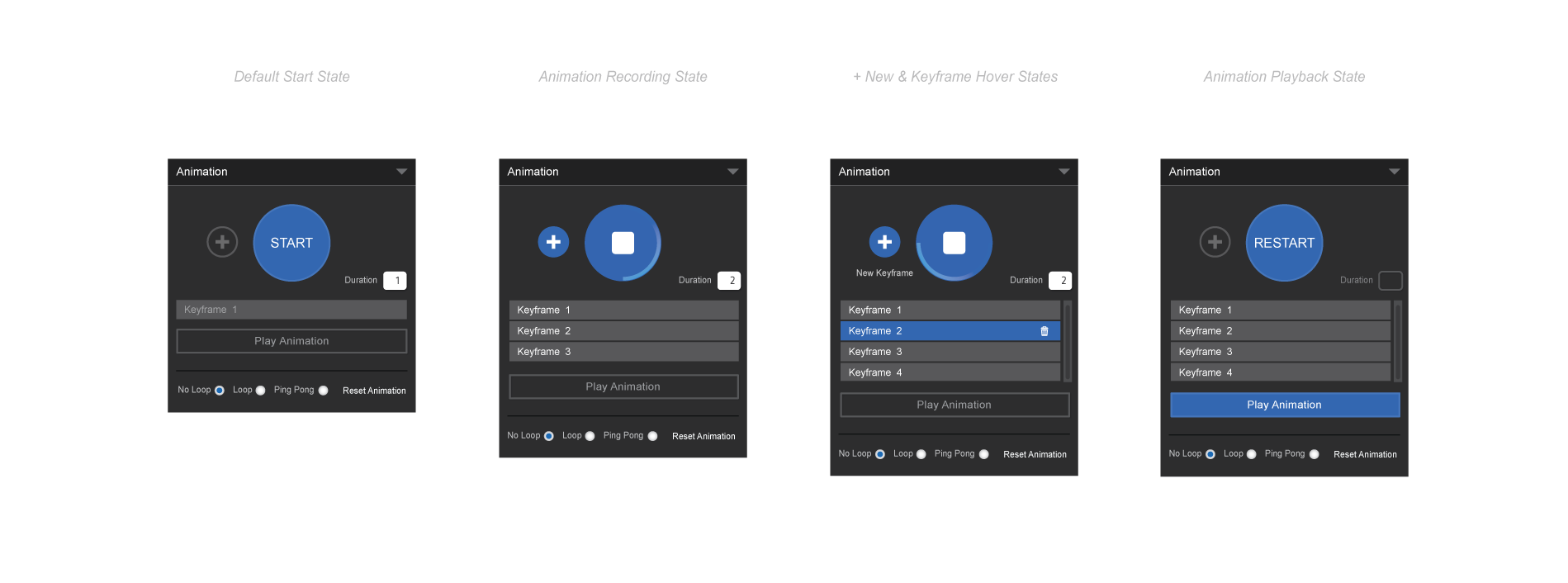
It was apparent our animation component was not very intuitive – it didn't even follow the recognized best practices for the most common features. For improvements, I first iterated on a more intuitive design following these known standards and later paper prototyped my end results. I tested it with individuals both familiar and those completely unfamiliar with the software. This process led me to make some minor tweaks to my original assumptions.
Prototyping is relatively cheap to do and can be quick to create, making it a cost-effective method to validate and improve the user experience within the feedback loop. Paper prototypes became the star of the show given my limited internal support for actual user testing.
Paper prototyping can be a valuable and revealing activity in design a process. Screenshots are depicted to help determine how the design/product might appear and a users' response to controls or functions is tested. Paper prototyping is a cheap-and-easy way to help shape conceptual functionality. If used early, unwanted waste in development costs can be avoided. It’s also useful in brainstorming, when searching for how to address users’ problems best. This “down-and-dirty” or guerrilla testing allowed me to informally test ideas with users and course-correct as needed.

However, the most challenging skill of a designer can be called creative selection. This runs throughout a project. It boils down to knowing when to say no. It's about trusting your gut and experience. It's about having great taste and always striving to refine and improve it.
This was as true now, when distilling user feedback on design iterations, as it was at any point in my journey to create a more streamlined, meaningful and friction-less experience for our users.
3.Converge
Extending the vision.
Empathy is trying to see the world from other people’s perspectives and creating work that fits into their lives and adapts to their needs. My job is to help them accomplish their goals in the most direct and delightful manner possible. This characteristic defines me. And it continues to be true as I work closely with engineers to help them extend the design vision into and through development and deployment.
Following the securing of stakeholder consensus, refinement of the design, content and user experience, the project progressed to the development phase. To effectually realize the design vision, it was paramount that I establish a close-knit collaboration with the engineering team through clear and transparent communication, adept comprehension of engineering restrictions and seamless collaboration. Mindful of cross-cultural disparities, I empathetically considered engineering constraints while working collaboratively with the engineering team to ensure that the design vision was not only practical but also aligned to user needs and business goals.
With my unique perspective, creativity and unparalleled design prowess within the group, I was able to create value for existing users while expanding our user base and industry-wide interest in our start-up.
Users of digital products are on a mission. Ours is no different. Users come to our product with a goal in mind. My job is to help them accomplish their goal in the most direct, easy and pleasing way possible. With this perspective, my positive impact was felt throughout the company and my influence continued to shape the future of our products.
I have an insatiable curiosity and a bias for action. I'm not afraid to take calculated risks that can challenge the status quo - pushing the boundaries and striving for excellence - while learning from start to finish.
As usual, I learned a lot. Following are a few key points: #1 Users have changing behaviors and expectations. What is true today, most likely won't be true tomorrow. Furthermore, once you expose them to a better way of reaching their goals, their goals can and will expand. #2 Eliminating friction can be one of the most powerful 'additions'. Often by simply saying no to an additional feature, or by removing elements of a screen or flow altogether can yield powerful outcomes. #3 Users increasing expect a more seamless engagement. This should go without saying. But along with it comes their reward when you truly match their expectations. The team learned a lot. It was evident that they learned the importance and value of process throughout. I believe the CEO learned a little too - there is value in getting users involved in the creation of a product. Because when you optimize for one, you optimize for none.
Post launch, we tracked a notable increase in demand and sign-up inquiries. Users responded well to the improved user experience and the clean visual redesign. The stage was now set. It was time to usher in the new leading act – our proprietary mobile apps – first for iPad, then for our custom hardware, the Smart Helmet.
Introducing the new 4D Studio®
4D Studio® Platform
As the first design hire within the tech headquarters of this start-up, I was tasked with owning the end-to-end product design for our AR publishing platform. This case study features my journey through a complete re-design of our consumer and enterprise SAAS platforms. During which, I created and implemented a new Design System, refreshed the look and feel and improved the overall user experience of the core of our product.
ClientDaqriServicesResearch, Ideation, Prototyping, Visual & Interaction DesignYear2018Linkwww.linkedin.com