Worksense® Mobile App Suite | Case Study
Gaze and wander.
With its gaze-controlled UI, this mobile app suite is software you literally wear. It enables you to wander about unencumbered — keeping you rooted in the context of your work. Featuring an intuitive and minimalist design, this end-to-end creation is nothing short of remarkable. Taking your tasks and workflows with you anywhere has never been easier or more empowering.
Changing times.
Scene 2. Take 1.
As this scene opens we find the company still waiting in bated anticipation of their proprietary hardware. Headcount has quickly ballooned from ~100 to around 400 employees from different corporate cultures in six offices spanning the globe. This growth has required our hero to evolve in his role from an IC to a Lead and mentor. The camera cuts to a shot of the latest Chief Design Officer heading for the exit as our hero briefly looks up and then continues to crank away.
As part of our shift towards enterprise – beginning with the merging of our 4D Studio product covered in the previous case study – we announced the development of a futuristic 'smart helmet' with integrated AR glasses. It was an bold project that was pitched to manufacturing, construction companies, architects and also the U.S. Navy. This project was going to require a lot of technical expertise so we embarked on a spending spree, acquiring AR software specialist ARToolworks, EEG headband maker Melon, manufacturing startup 1066 Labs and holographic display developer Two Trees Photonics. Hence our rapid growth. Our creative and technical challenges were immense. Our CTO initially bet on Android to run the apps on the helmet, only to change course and switch to Linux/4JS soon before the hardware was supposed to ship in late 2016. Unfortunately we all learned the hard way that we can't develop workplace products exclusively in a lab. The helmet, was a highly specialized piece of equipment with sensors like a thermal camera and much more. Unfortunately, my research would reveal that workers in the field often only cared about much simpler features, like the ability to see what's behind them. Or they didn't want to be bothered with technology at all and found all the bells and whistles alienating. What could possibly go wrong?
The new lay of the land.
New Design System Library
I had consolidated the strengths of each previous effort into a new and uniformed visual identity. I now had a Design System Library to use to guide our efforts.
Multi-modal Approach
Armed with my new creative vision, we could confidently pursue an extended approach across all future display mechanisms.
Tight Integration
With all design aspects dialed in, we were able to integrate consistently across publishing platform and remote smart devices.
35 Minutes
0.Challenge
Watch where you step.
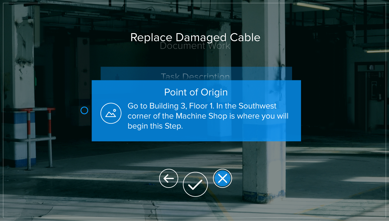
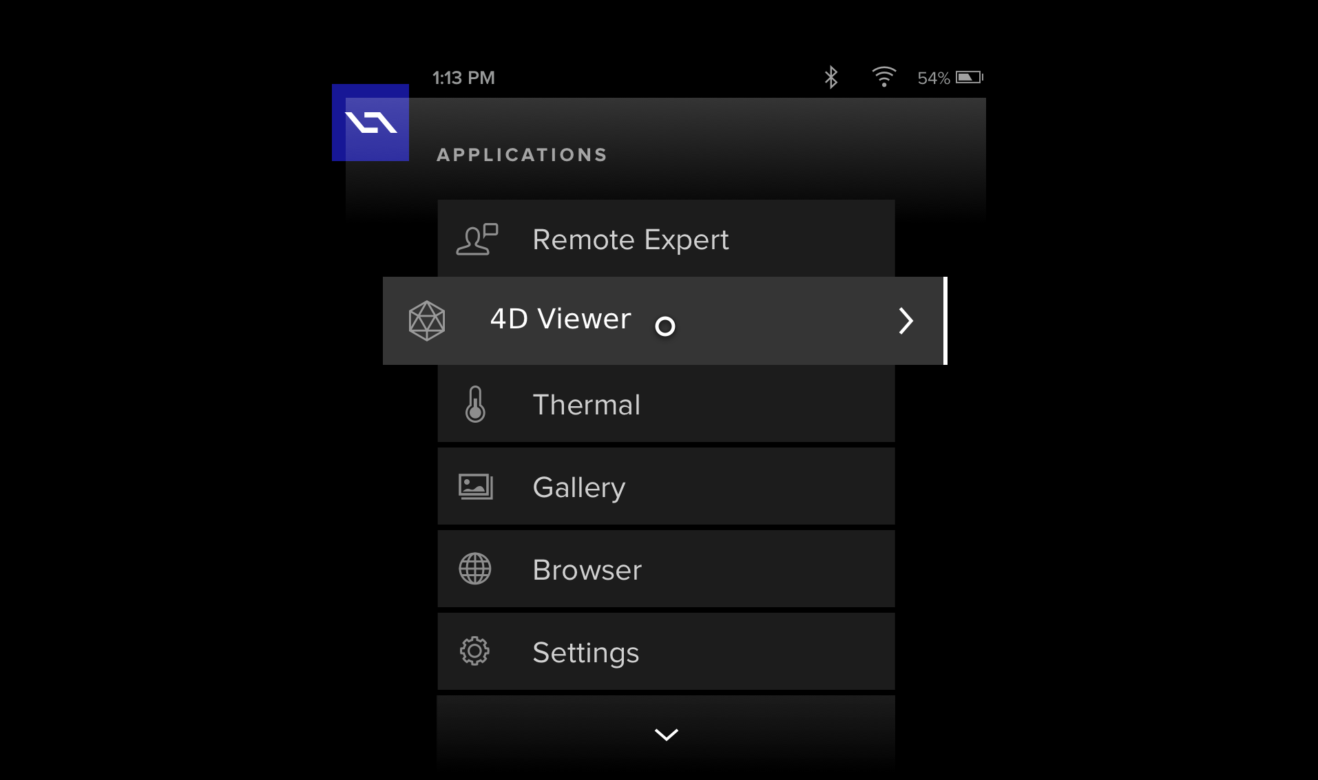
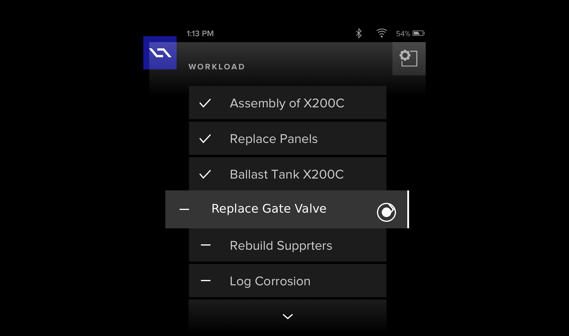
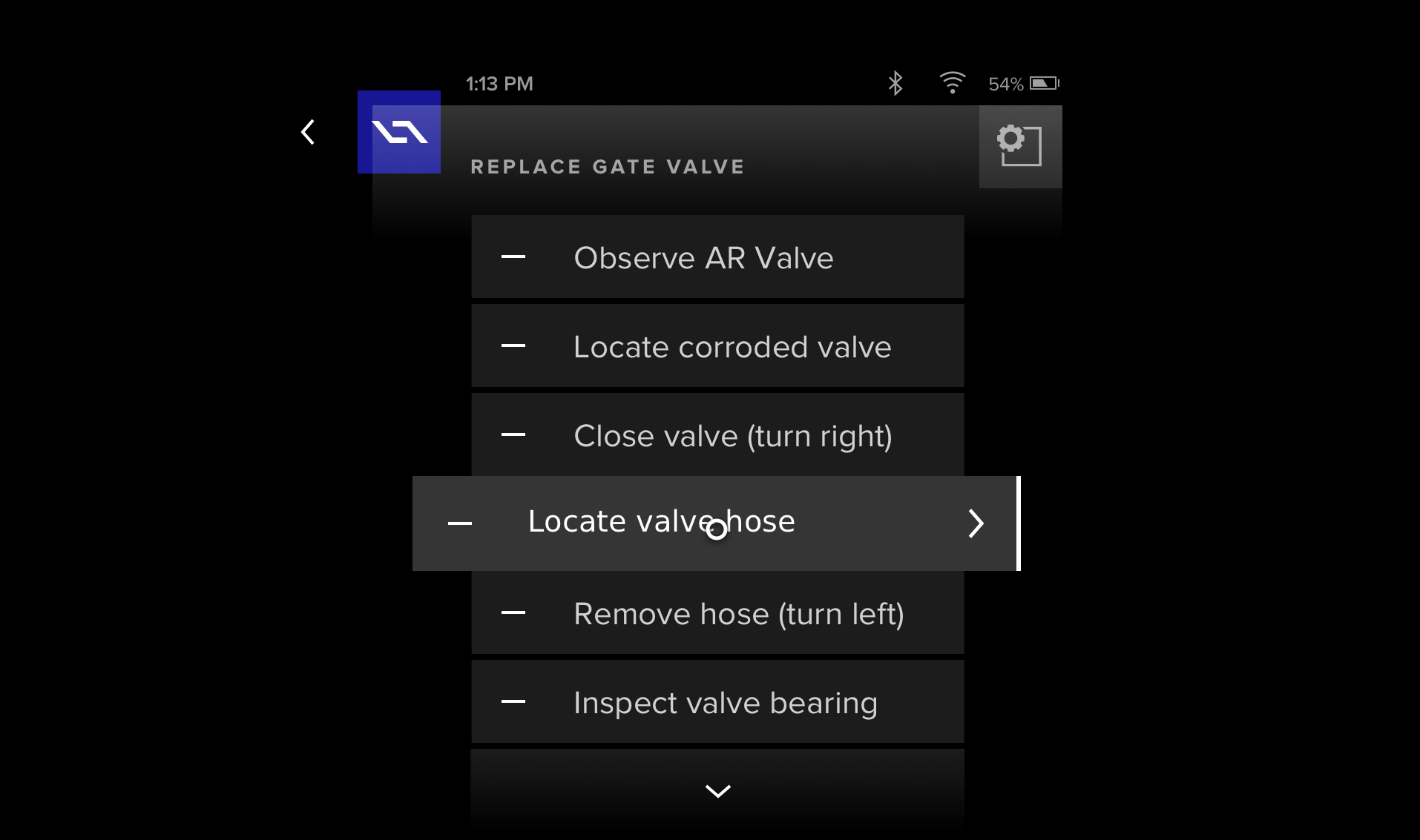
The challenge was seemingly simple – design and deploy a mobile application that would work in conjunction with 4D Studio. But not just any application. It needed to function in a hands-on manner that would support workers in the field as they performed their job duties. Workers would be on the move and in demanding environments, potentially dangerous ones. Users would be focusing on their surroundings, while interacting with the user interface – nearly simultaneously. Some might say we had our work cut out for us.
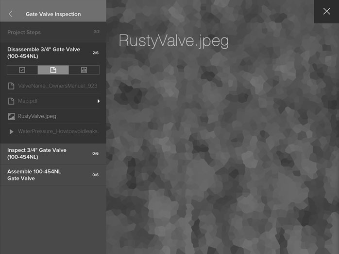
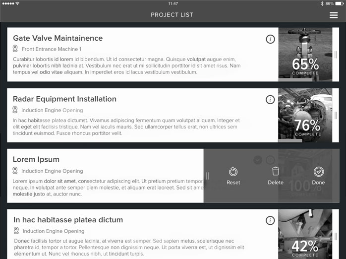
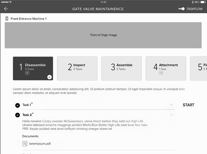
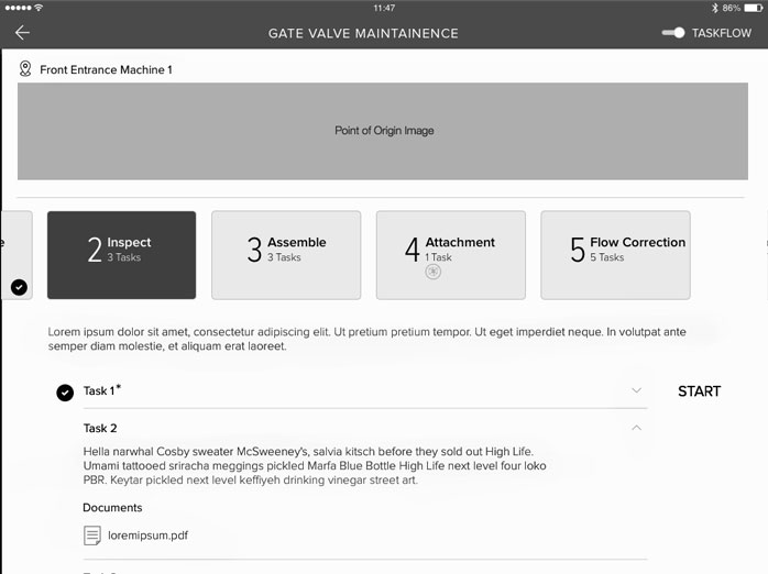
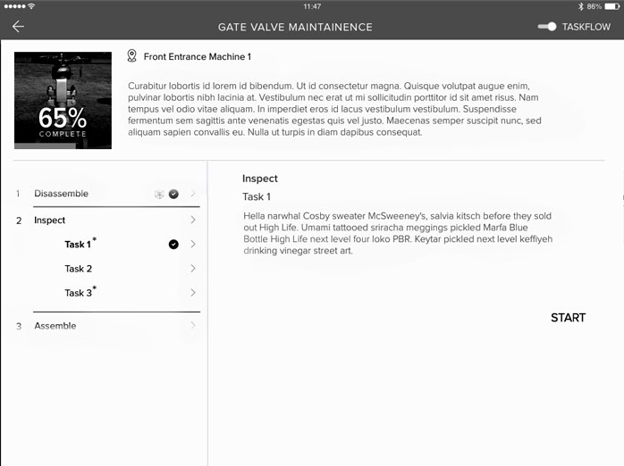
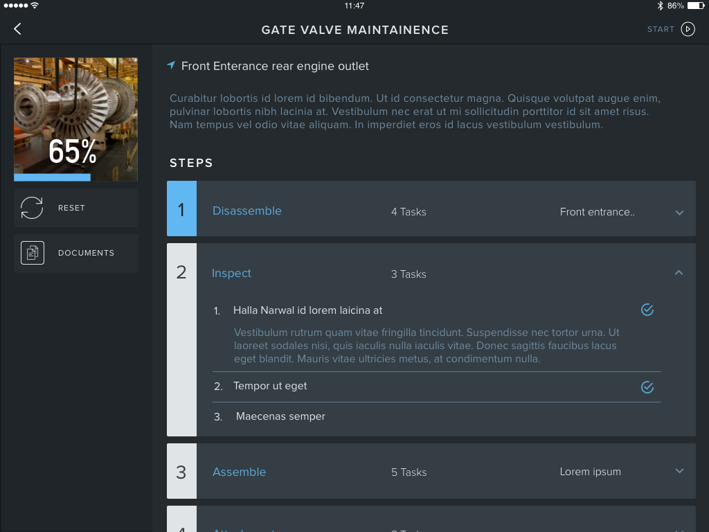
On the heels of the new 4D Studio release – previous case study – we next set our focus on creating a tablet app to display the published AR content. This was to be a stop-gap measure until our smart device was ready. With much of my hands-on work dedicated to iterating on 4D Studio, I was asked to direct a team of contractors for this stage of work. Having created the design direction for 4D Studio prior, it was natural for me to expand my role in this manner and to meet the growing needs of the company. Enter the outside app development firm Carbon 5. After some vetting, they were hired and I kicked off an on-boarding to get them up to speed. I presented my DSL, our brand guidelines and extensively reviewed our product and market fit. Additionally, I led the creative sessions in which a general approach was agreed upon based on my (earlier) initial concepts. This way I was able to set us all up for success. With my conceptual direction in place, we worked closely over the next month or so, to execute on the following tablet application.
1.Ideate
A show of hands.
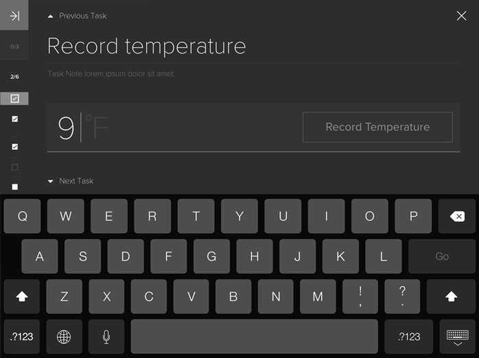
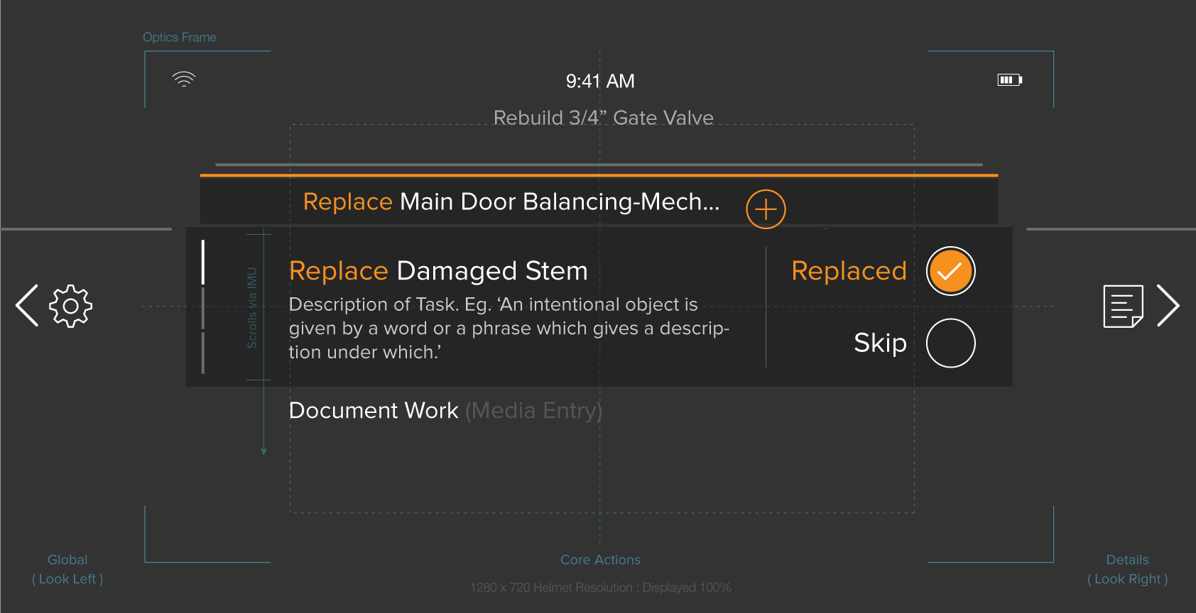
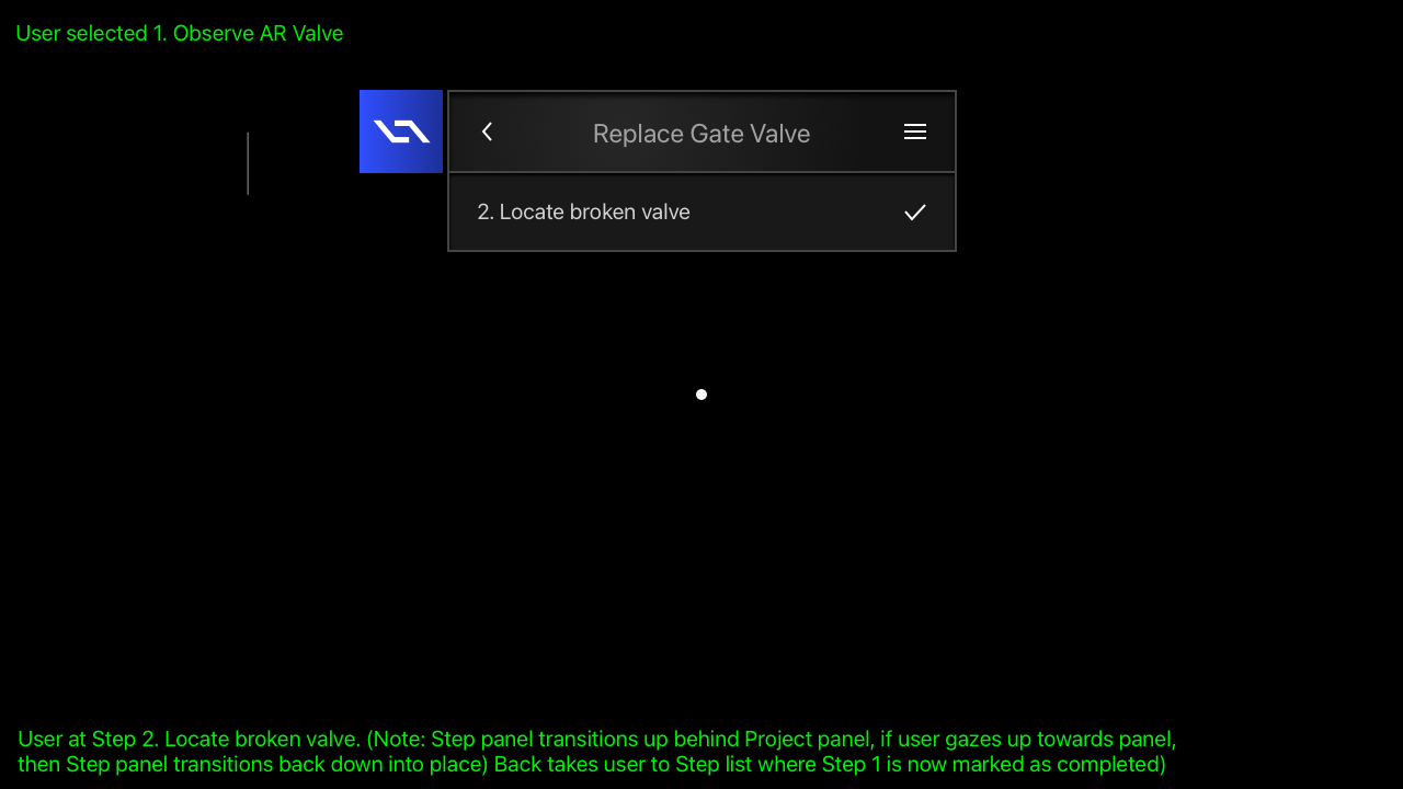
The app's structure would be dictated by the workflow within 4D Studio – from which content was ingested. However, ease of use was going to be the most important aspect. Of course, it had to be intuitive. Most critical, we had to understand the reality of the user's hands-on physical world and almost anticipate their needs. No small task. This would again come into play significantly with our future proprietary device – the Smart Helmet – when touch inputs were removed.
Let's break this down. First, support for the complex functions of a set of published work instructions from 4D Studio was necessary. Second, allowing for quick and easy interaction with these instructions via the mobile app while users were doing their job. Think of it like this. You are rushing between gates at an airport, navigating physical obstacles, listening to environmental cues and interacting with elements in that environment while you are following directions and logging your progress on a mobile device screen. Demanding, to say the least. K.I.S.S. – would become our guiding motto. Armed with this laser-focused understanding of the why and what, I had created a series of concepts for the application. With the layout dictated by the structure within 4D Studio, I focused great attention on minimizing all non-essential UI elements so as to not hamper the user in the completion of their tasks. The UX was designed to allow quick access to primary functions of the application while also embedding "power user" functionality a tap or two away. Later, the team and I collaborated to further refine my initial concepts into a visually stunning UI.


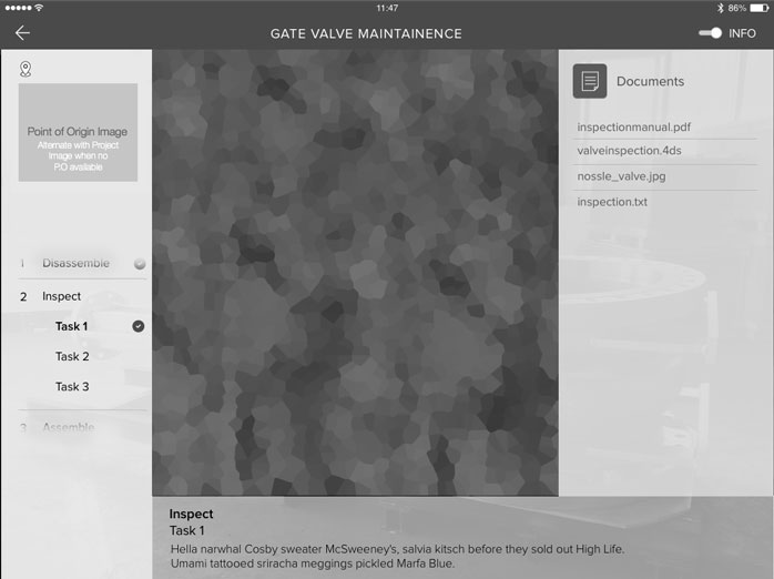
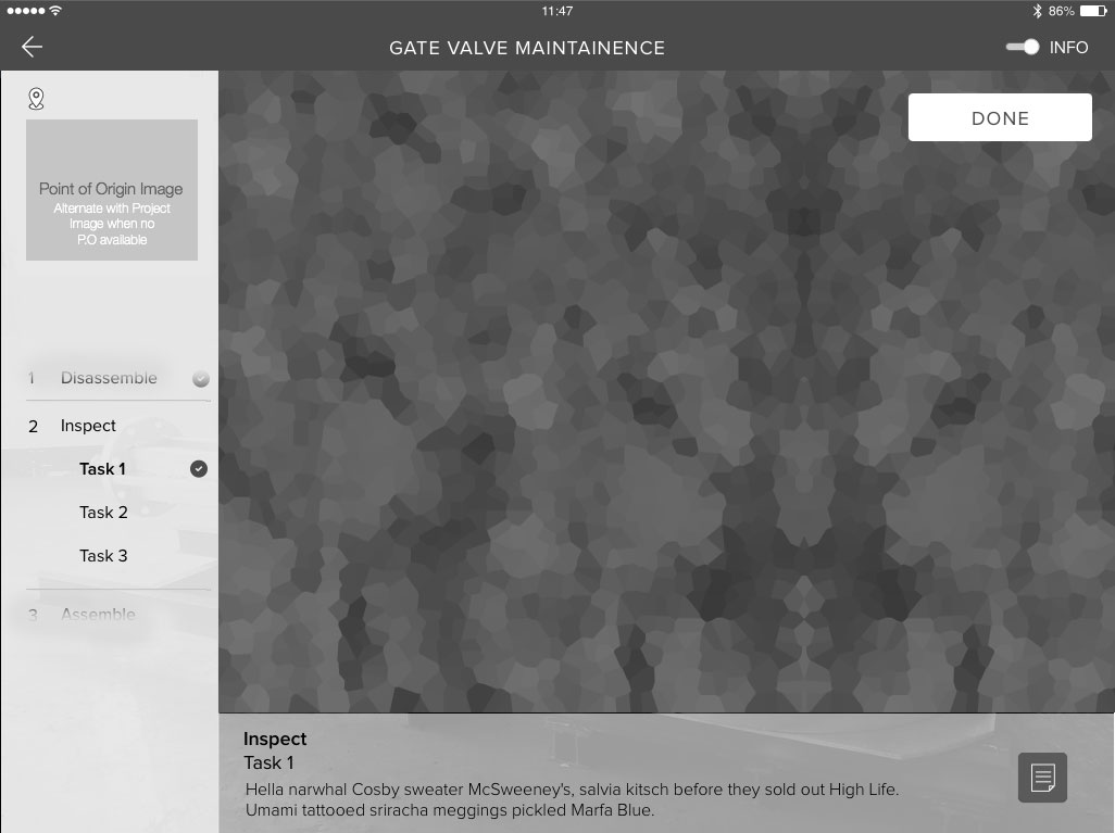
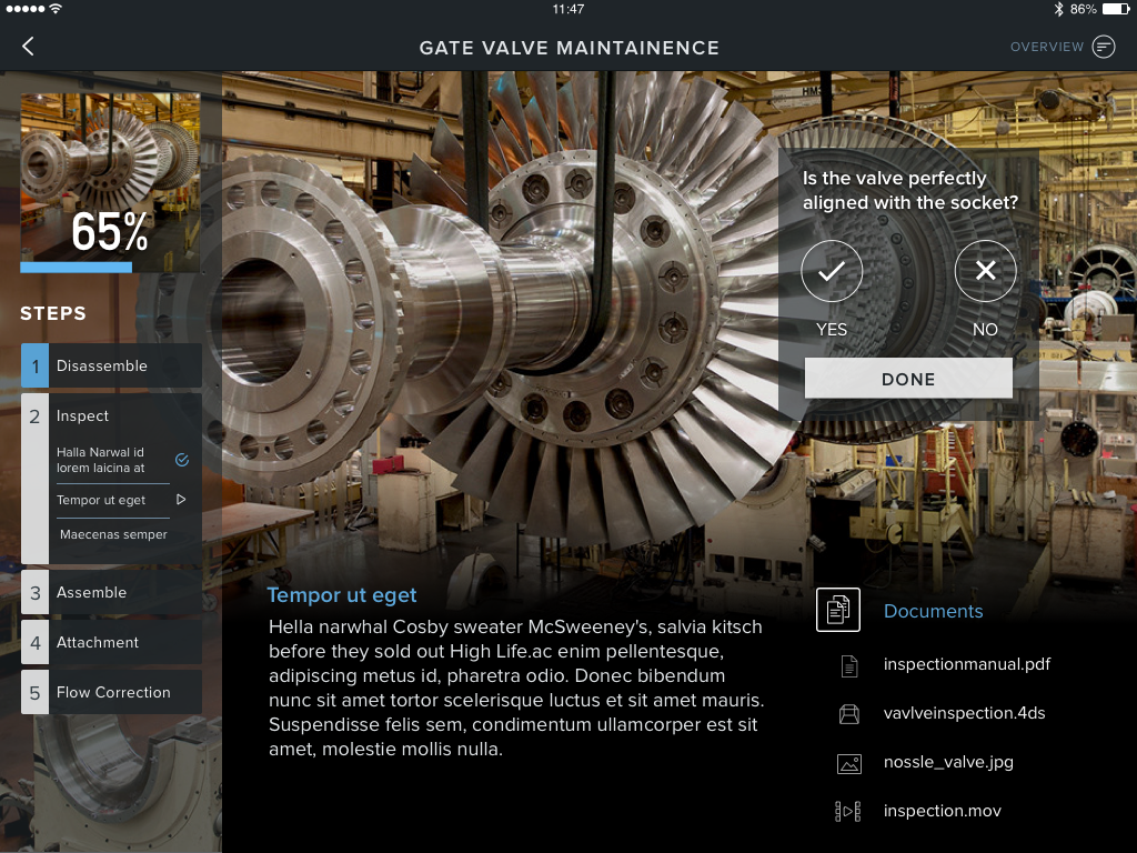
My intention with the visual effort was to have the look and feel draw inspiration from my extensive design work on the 4D Studio platform (previous case study). Intentionally utilizing the same types of transparencies, overlays and subtle design color cues in the UI, would serve the user's needs and maintain consistency. While equally allowing the UI to fade into the background, thus exposing the real-world settings, to take center stage. The color palette was carried over – simple, clean and professional. Delightful subtle user experience interactions were meshed throughout to heighten engagement and delight. The final look & feel is readily recognizable from my design work featured on 4D Studio. This is intentional and a natural extension as well as progression of my product design vision.


While the design work was wrapping up on this tablet application, it was time to say goodby to the contractors. I was already shifting my core focus onto the app suite for our pending hardware device. The tablet app would allow us to test various aspects of 4D Studio publishing, while ultimately re-directing all discoveries towards the smart device's app suite. Therefore, I began to ideate again on what this experience would be on a hands-free, gaze-controlled device.
1a.Re-ideate
The eyes have it.
I have stated before that I believe diligence is about doing the necessary grunt work and always giving it your all. This personal attribute goes hand-in-hand with my ability to thrive in ambiguity, drive multiple initiatives simultaneously and when necessary, change directions on a dime. But who would have guessed that the CTO would pull a good 'ole switcherroo with our development platform midstream?
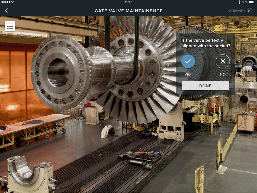
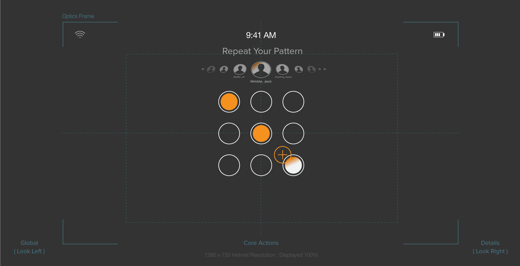
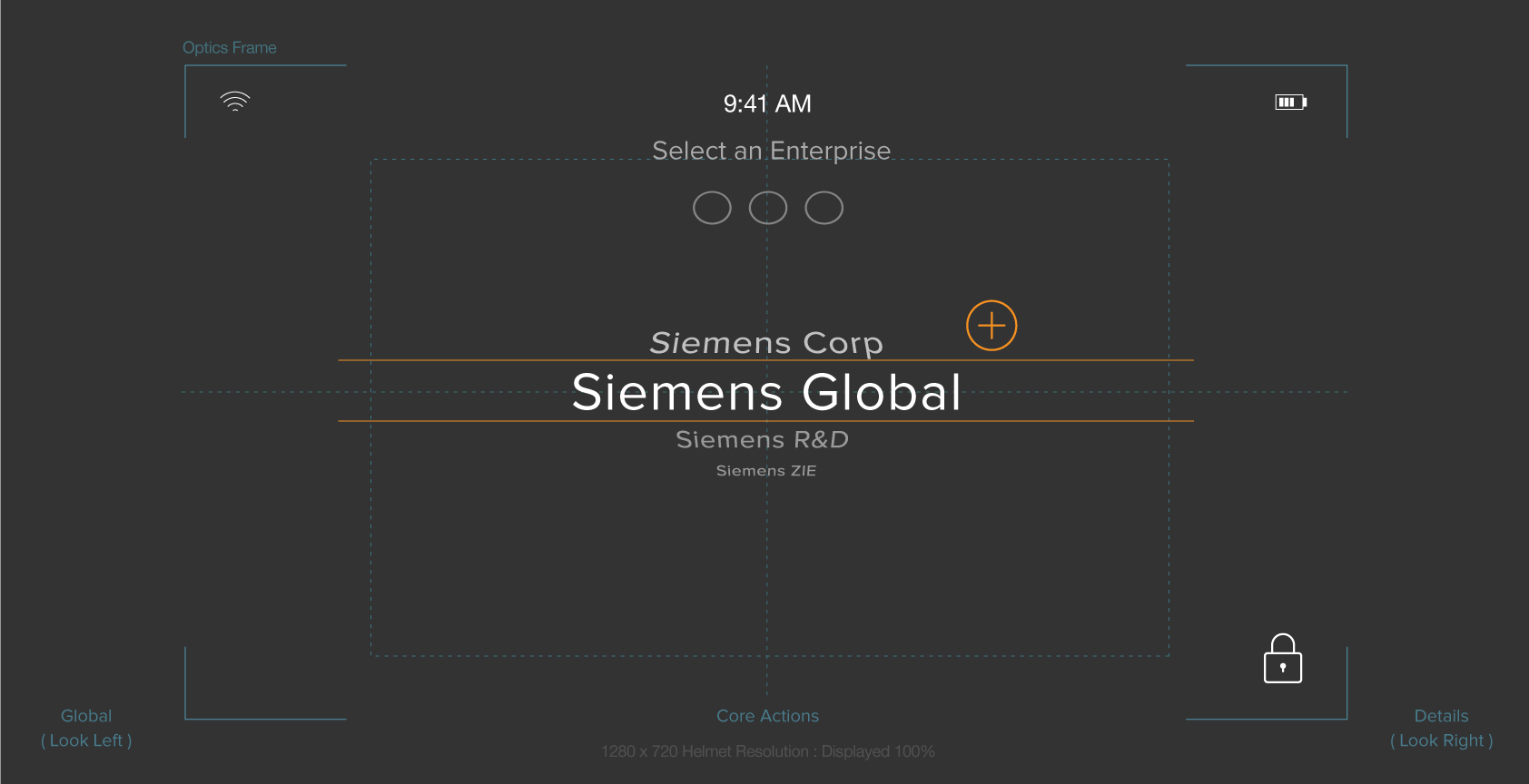
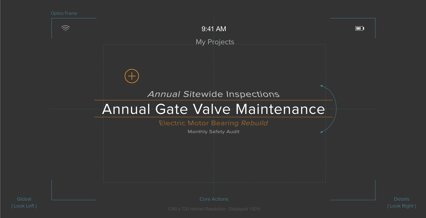
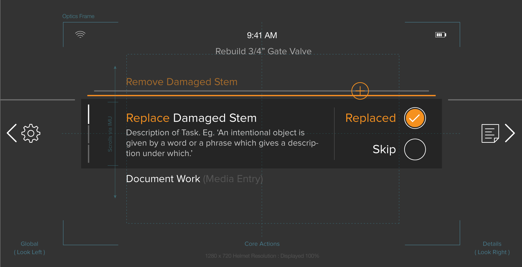
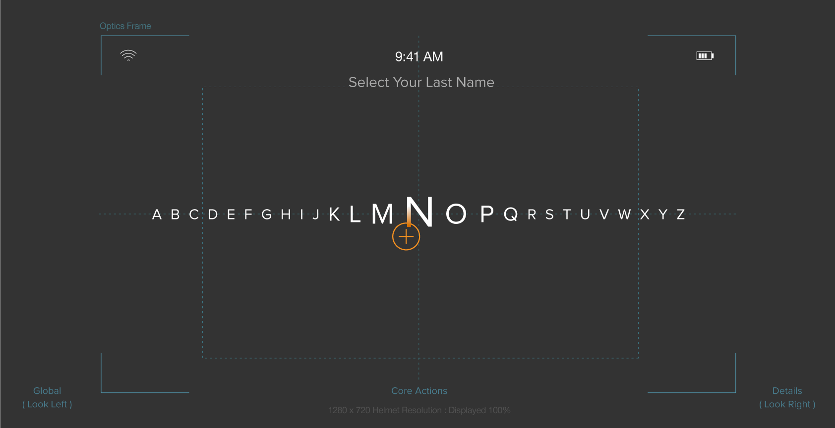
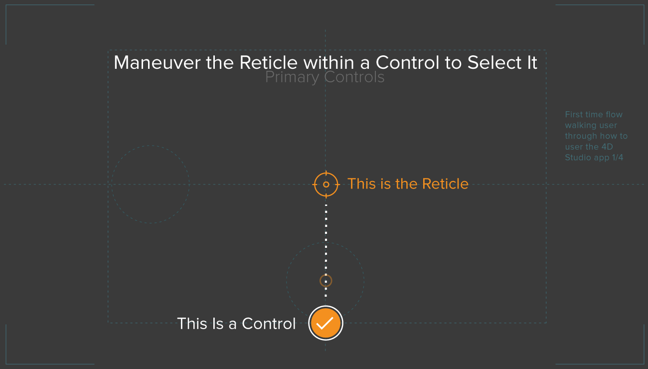
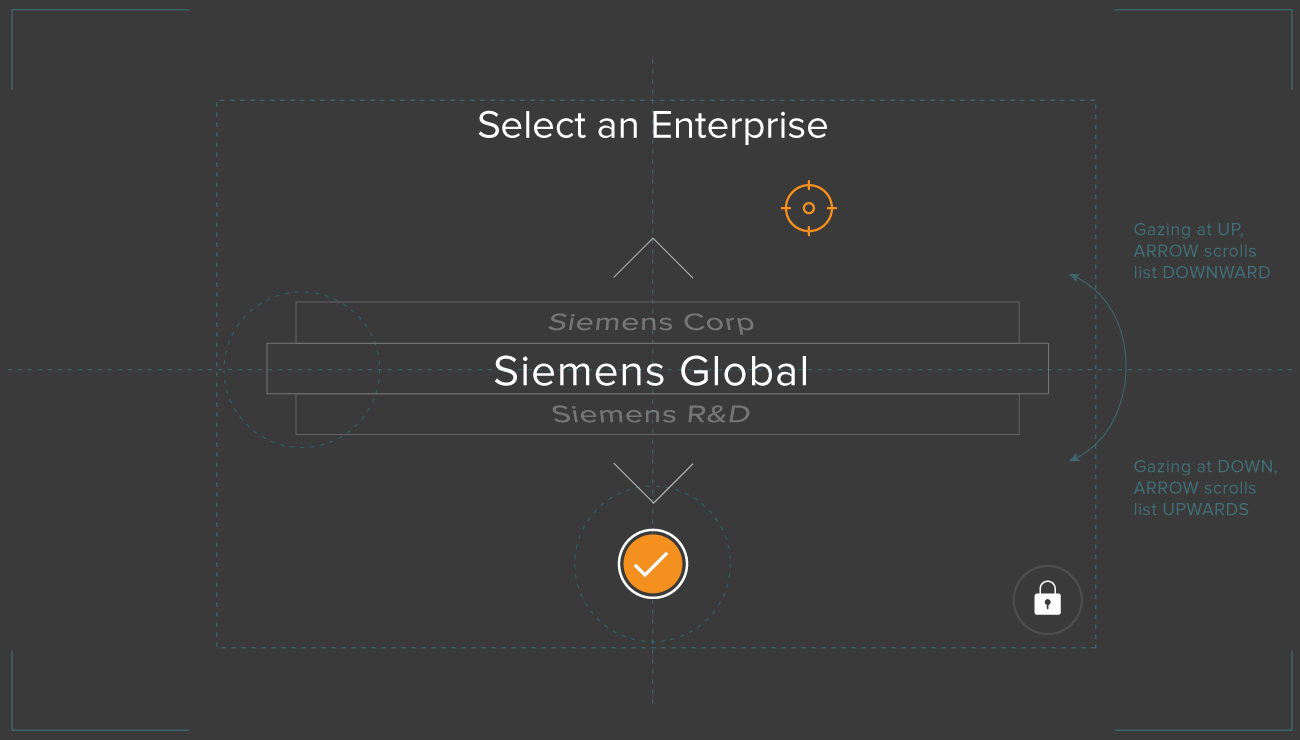
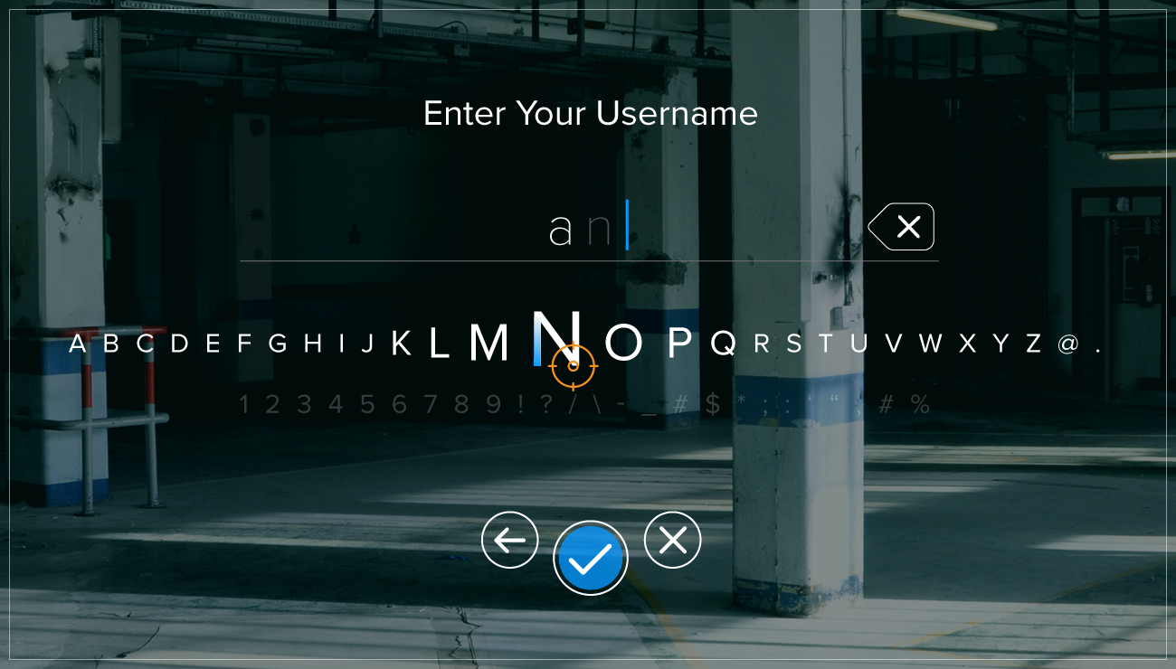
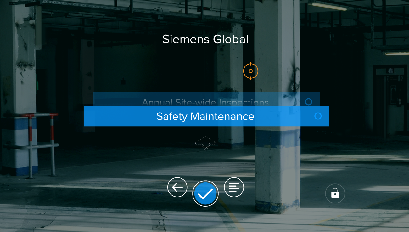
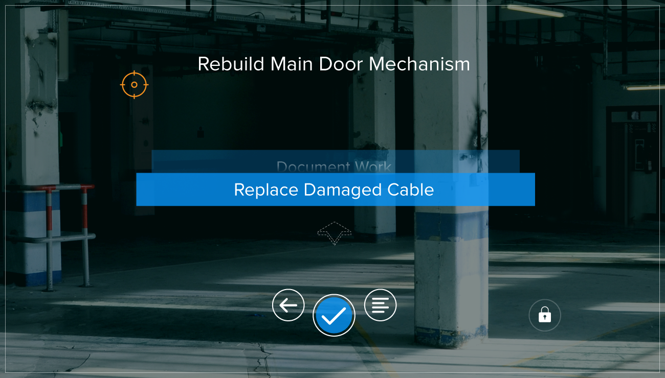
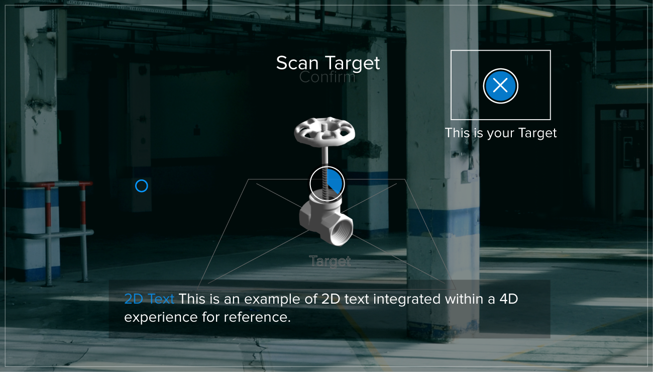
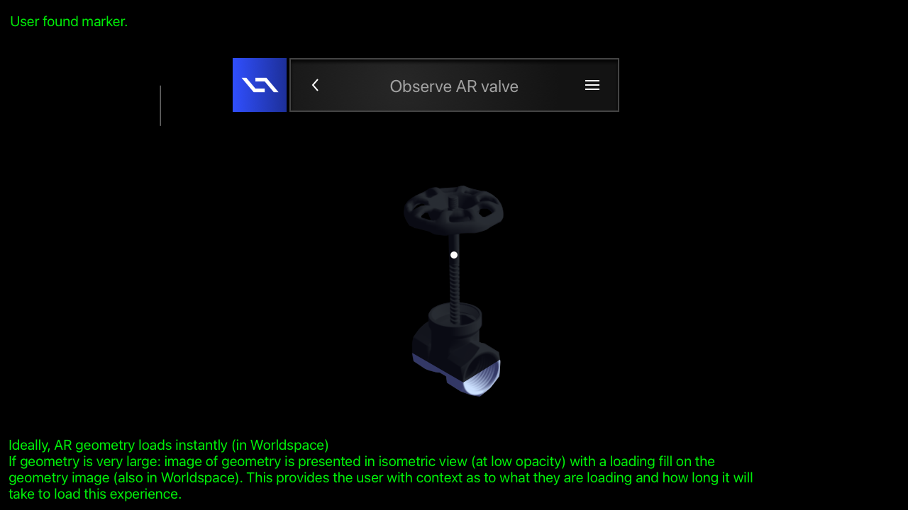
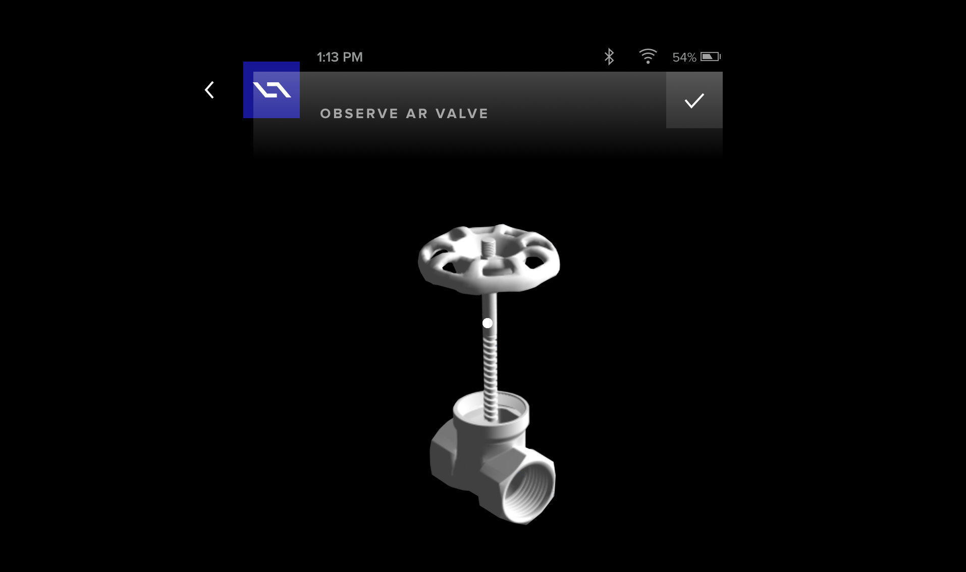
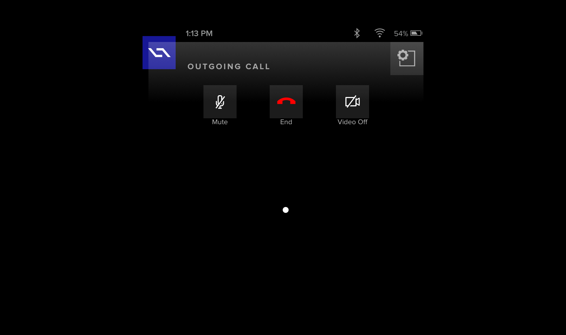
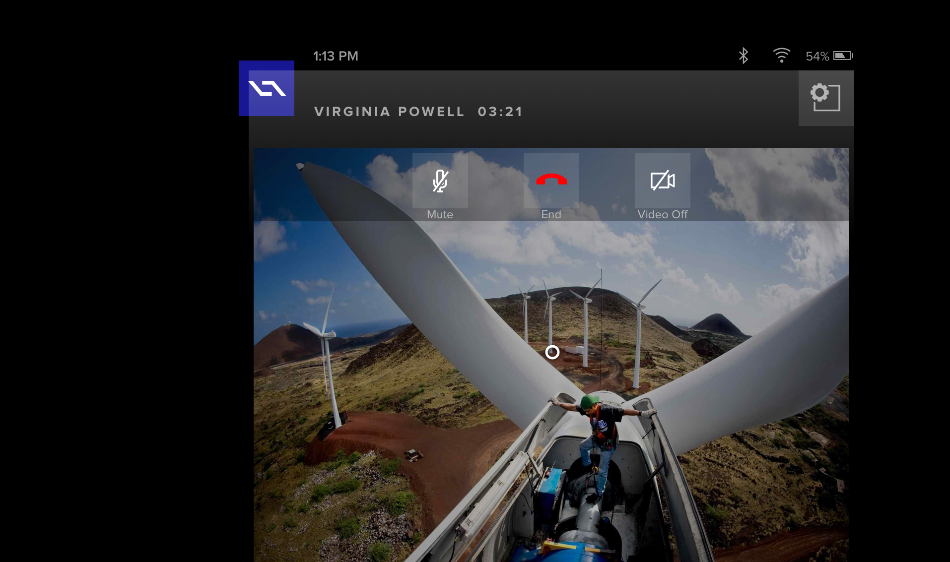
Who would have guessed? Well, me for starters and anyone else that was paying attention. I was accustomed to change and re-direction. I feed off of challenges and I rise to every occasion. Therefore, when asked to additionally take on the design of the software for our pending smart device – which was still yet to be created – I jumped at the opportunity. The first challenge here was the same as with our tablet app – design and deploy a mobile application that would work in conjunction with 4D Studio. However, this time it was different. Very different. Our device would be using gaze-based interactions to control applications. A digital artifact, called the reticle, appears on the displays in front of the user in space and follows their head motion. There would be no mouse for interacting with the UI. The decision came down from above to use a gaze tracking and a reticle as a controller. The Daqri Smart Helmet (DSH) was conceived to make industrial jobs easier by overlaying instructions on complex equipment — a relatively common use for AR headsets. It was envisioned as a combination safety helmet and AR headset that overlays virtual instructions, safety information, training and visual mapping on a real-world background. Workers in the oil and gas, automation and manufacturing sectors often need to understand complicated instructions to perform complex processes. The DSH would enable them to see digital information overlying different contexts — a physical controller, a scanning device or quality control meteorology equipment. The core user of these apps were typically field workers. The worker that is out there day in and day out, in the physical environment. A field engineer may be responsible for 600 different work packages, using some perhaps only once in a career. Having the added data when it’s needed makes a big impact. With the 4D Studio platform users were desktop bound. However, these users were the "consumers" of that content and on the go. The first major roadblock of this challenge was the fact that our hardware wasn't even out of the lab.
"I know you don't have access to our hardware, but I need you to create the mobile apps that will be running on it when it's ready. Is that going to be a problem?"
– Daqri CEO
Eventually, I would get my hands on our hardware. But amazingly, I still had to progress with design work without one to test on. I had to get creative and employ numerous clever "work-arounds" in the meantime. One such approach was securing access to the same display lenses that we would ultimately use in the smart device – to mirror my design to for testing from my laptop. This allowed me to realize and alter transparency, depth of field issues, lighting and color issues otherwise unforeseeable. Prior to this approach, I was literally designing blind!


"We need to switch our tech stack immediately. I know I said we were betting on Android, however that's changed. We will now be developing our apps using Linux and custom Three.JS (4JS). Sorry guys, you'll have to redirect all your previous efforts."
– Daqri CTO


"Hey Neil, can you design a logo and App Store icon for our custom Three.JS (4JS) framework in between your current work? We will be releasing this shortly to our developer network as a company-branded offering."
– Director of Engineering
As an incredibly versatile and adaptable designer, I have been tapped many times in my career to create original branding and marketing materials. This app store icon request, simply brought me back to previous comfort zone where I was executing custom iPhone applications in the early years of Apple's App Store.
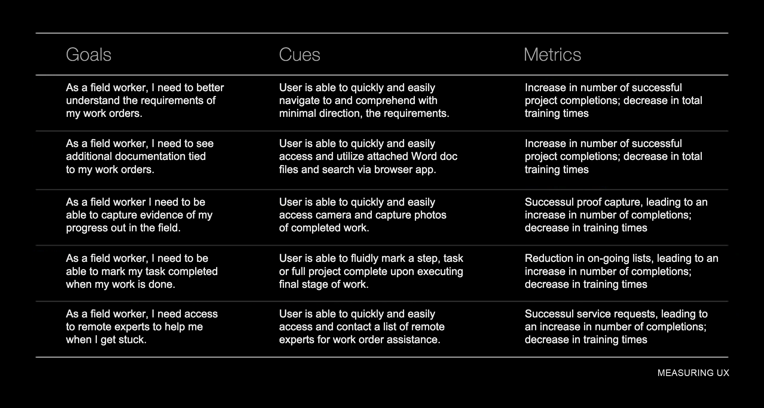
You may recall that from the start I never really had internal support for actual user testing. Our CEO felt he knew what our users needed and didn't care much to interview them or get any feedback. Due to my gorilla efforts though, over time I was able to amass some user data. This data informed me where to place our focus and what to iterate. I was able to employ the data in assisting my decision making and adjusting my assumptions. To help gauge our success, I settled on a series of user-centered metrics that allowed me to measure the changes we were intending and the eventual outcome. This all improved over time as we eventually got the benefit of a dedicated user researcher added to staff.
Eventually I had a handful of studies available to draw from to better understand the pain points out in the field thanks to the addition of a researcher to the team. From these, metrics were identified. I had to take into consideration the challenging conditions that would compete for our user's focus and attention while using the UI.
Our initial team was primarily comprised of myself, a Product Owner, a Front End Dev, three Back End Devs and one QA. I was charged with owning the end to end Product Design – inclusive of conceptual, visual, interaction, research and testing. We were small. We were scrappy. But the design team was now growing. Fortunately as time passed and we progressed, I joined forces with not only a dedicated researcher, but also two other product designers to help me hone and perfect our outcome.
2.Validate
Having a field day.
The largest user base for our proprietary device, a hard hat with display lenses, was among field technicians and engineers. These field workers might be responsible for hundreds of work activities – only to perform a handful of them on a regular basis. My design team had limited access to our pilot users for testing. We often had to rely on our taste, experience and gut. We became a well-oiled machine at reviewing each other's work.
The most valuable feedback can sometimes feel critical. It's imperative to leave personal feelings and ego at the door and to consider all suggestions - even if they completely re-direct the work. We were great at this. As a team, we met regularly to review each others work. Especially given we were now spread across numerous offices and countries. Up to now, the approach was primarily based on our assumptions. With our new researcher on board, user research and testing served to inform and validate our design approach. Users were brought in, interviewed and allowed to interact with the early work. Notes were taken and reactions recorded. Our reviews and testing suggested we revisit and challenge some of our previous understandings which led to many iterations. On top of that, we were often re-directed throughout due to frequently changing design leadership.
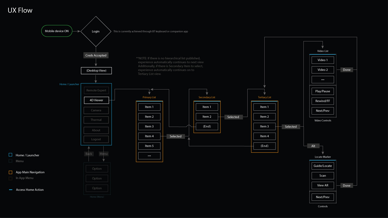

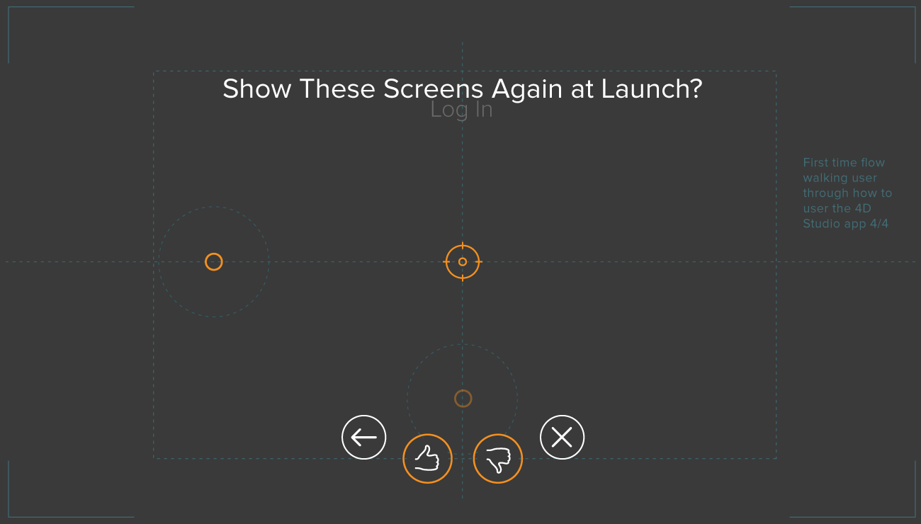
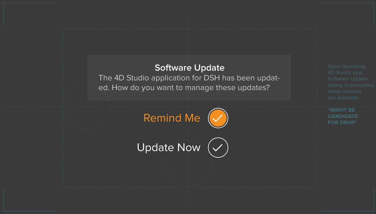
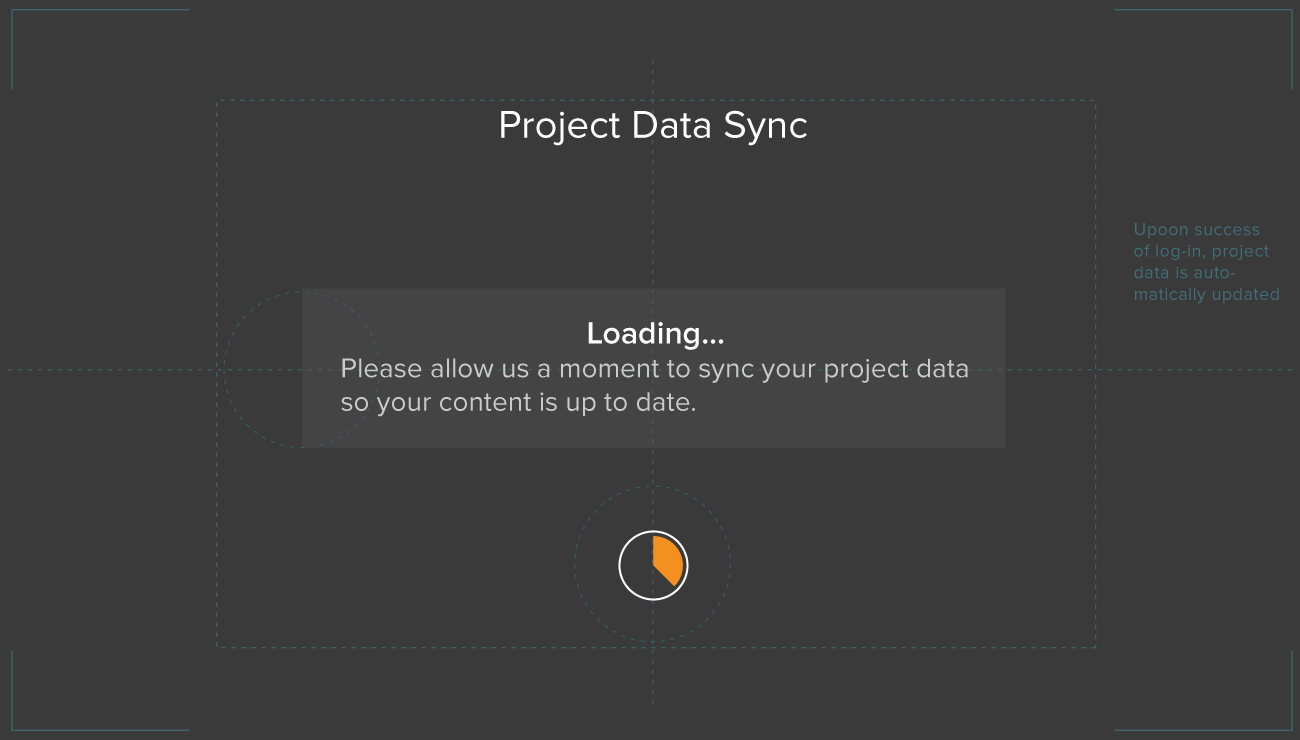
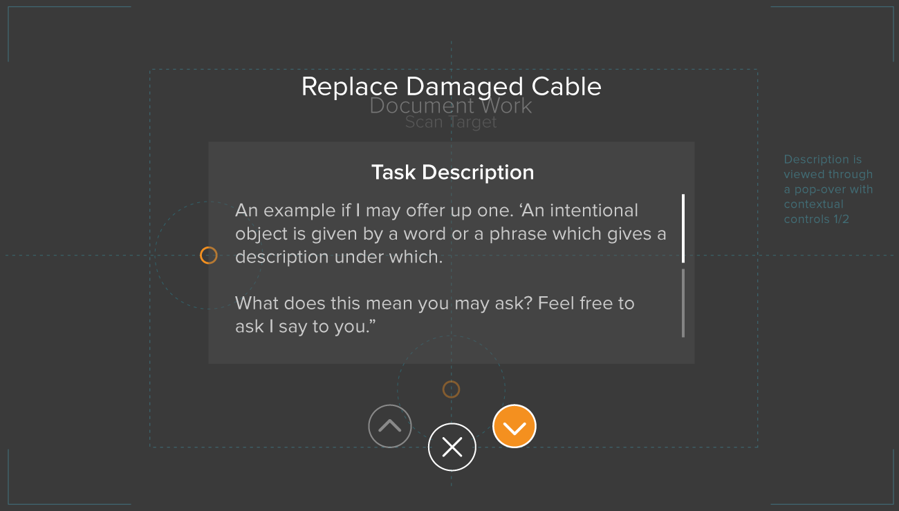
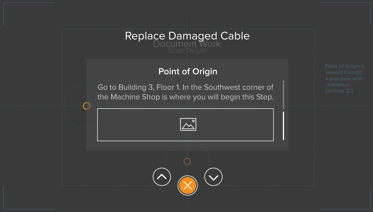
I created the following design approach that was based on our switch to Linux and 4JS. In it you will recognize many patterns that followed us through the various iterations. But with this change, came new and different technical constraints. It was essential that I continued my close collaboration with our DEVs to ensure what I envisioned was technically possible. Note: Background imagery is suggested as this UI would be displayed on lenses over the user's real, physical environment.

You may remember, at the start of this saga – AR Authoring Platform Case Study – where I stated that "I crafted endless creative solutions for seemingly random requests, shrouded in ambiguity, from a revolving door of cast members". This stage of work saw the introduction of yet another new Chief Creative Officer's (and his short stint at our company). With his arrival, came a new design direction mandate.
"I'd like to introduce you all to our new Chief Creative Officer. He will be taking over for name redacted and guiding us towards his new direction for our suite of apps. Now let's give him a warm welcome and all get back to work."
– Daqri CEO


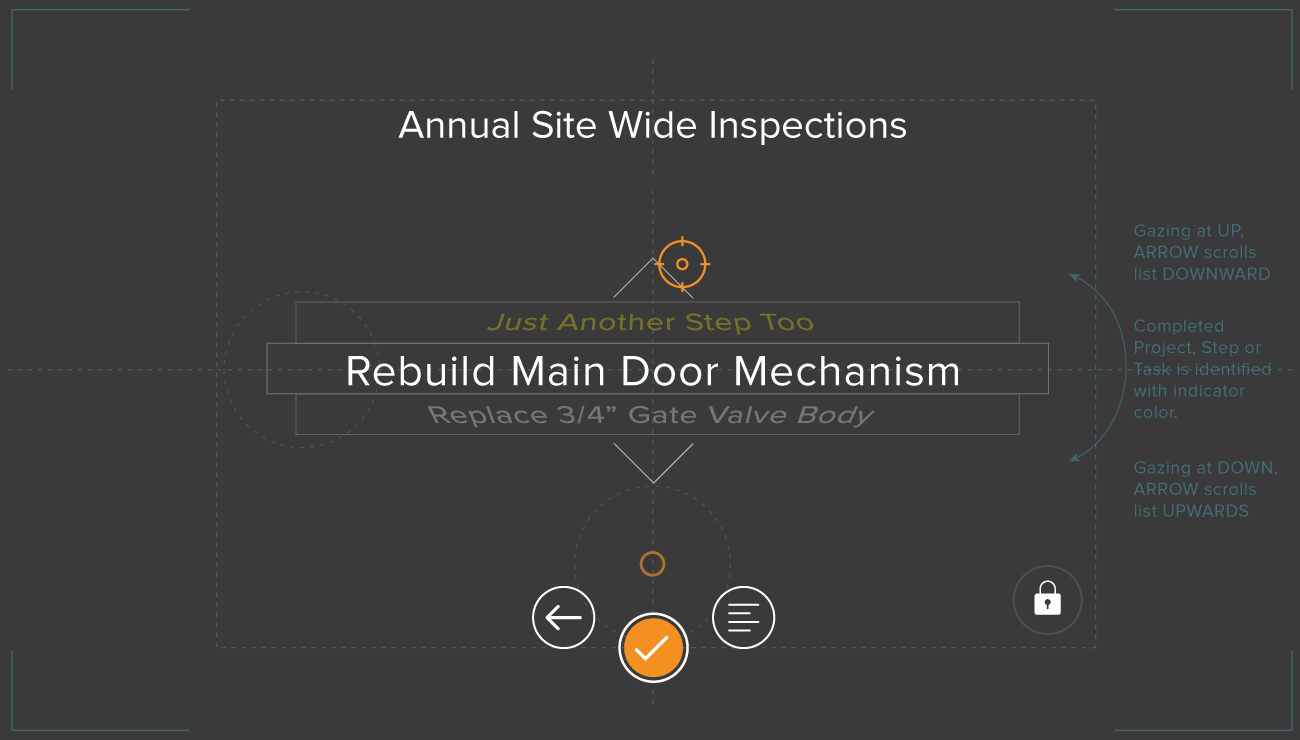
Throughout, interactions were vitally important to support and enhance good user experience on our mobile interfaces. On our proprietary hands-free device – The Smart Helmet – thoughtful, intuitive and efficient interactions were beyond essential.
The users of the Smart Helmet were to navigate with a pointer (reticle) on screen using subtle movements with their head. Therefore, every interaction had to be conceived, designed, mapped and tested time and time again. Imagine if you will, navigating your computer screen with a laser pointer in place of your mouse and you'll get an idea of what we were solving for within our designs. Unity was a go to choice for building out the production-level 3D experiences. However, I often employed some much faster techniques – simple animated frames – to quickly test out a theory before allowing Unity to consume so much of one's time.
With my ability to adapt and thrive in an ever changing dynamic environment, I was able to succeed where others may have failed. Furthermore, with my unparalleled design experience within the group, I was able to help our junior team members reach their own levels of success. That is to say, until one final change was too much to overcome.
This was as true now, when refining our design iterations, as it was at any point in my journey to create a streamlined, meaningful and friction-less experience for our users.
3.Converge
The final act.
The day started like any other – a rather beautiful one for February. I was working remotely that day when the cards first started to fall. In the middle of a chat my fellow designers Anthony, my messaging app went offline. Well, it didn't go offline, I did. I was locked out – of everything. After confirming the same had happened to him and others via text, I knew this was the end – our final act.
Prior to that fateful day, we had been polishing the design, content and user experience. To effectively develop and deploy the design vision, it was essential for me to collaborate closely with engineers by communicating clearly and openly, considering engineering constraints, and working together throughout the development process. I took into account engineering constraints as I navigated cross-cultural dynamics. Our engineers and I collaborated all along to ensure the design vision was feasible and that it would meet performance and reliability requirements. My final act saw me working very closely with my fellow designer and our engineering team to bring to production the last iteration of our software. Anthony, Sterling and I had taken our 'final' release to new heights. We had traversed many diverging roads and overcome huge obstacles. Through it all, we had done it together. We were finally at a state where we had a working hardware prototype and an implemented software suite running on it. We had gotten the opportunity to do some initial testing and the feedback was encouraging for our design work. I was looking forward to learning more, to doing more iterations. But that was not to be. We, the entire design team, had been selected as the tip of the spear with the first round of cuts. Perhaps we were a casualty of our own successes?
The most challenging skill of any designer worth their weight, is creative selection. This runs deep and throughout a project. It comes down to knowing when to say no. It's about trusting your gut and experience. It's about having great taste and always striving to refine and improve it.
Despite being bounced between the whims of revolving door of Chief Creative Officers, we became quite good at selecting, refining and iterating our approach. We took the best from the worst of situations and used it to our advantage. We continually advanced the design to the 'final' outcome following this late stage iteration.


I learned a lot throughout this experience. I learned that solving problems for an industry and technology I had no prior knowledge in, was a sweet spot for me. I fed off of the challenges and thrived in the environment. As a designer who had no prior background in Augmented Reality, all I needed was empathy, curiosity, taste and constant iteration to design incredible experiences. With these elements, I've learned I can create meaningful relationships with our users that can ultimately shape our product into one to be proud of. Users of our product are on a mission. They came to our product with a goal in mind. My job is to help them accomplish their goal in the most direct and pleasing way possible. I believe we would have received favorable results with our work had we been given the chance to fully complete the design cycle. Our influence would have continued to shape the future of our product and help users reach their goals. But we would never get the chance to really know the impact of our work.

Make no mistakes, I didn't enter any of this with rose-colored glasses on. I was very excited about the work and the company's potential when I first started. However, I always felt we were either going to the moon or going bust. There was not going to be a middle ground. As we were nearing the end, a bit more of me felt more strongly towards the latter.
Empathy is trying to see the world from other people’s perspectives. My job as a designer is to help users accomplish their goals in the most direct and delightful manner possible. This characteristic defines me. When it comes to business though, there is seldom room for much empathy, especially during a downturn. This wasn't my first rodeo. I had been through other general tech downturns and I have seen it all. I felt for my less experienced counterparts. Initially, this was going to be tough for them to swallow. However, I was massively confident that a handful of them were going to reach higher highs in the next stage of their career. I too, would carry on and adapt. The following production-level UI release wouldn't have been possible without the close collaboration between myself and my fellow designers Sterling & Anthony.
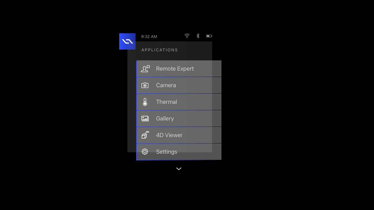
A magical new way to interact with digital content while navigating a physical space. Groundbreaking gaze-controlled interactions designed to vastly improve your productivity in the field. An innovative user interface for mind-blowing task completion. All running on the ultimate workforce companion – the just released Daqri Smart Helmet.
Introducing Daqri's Smart Helmet Applications
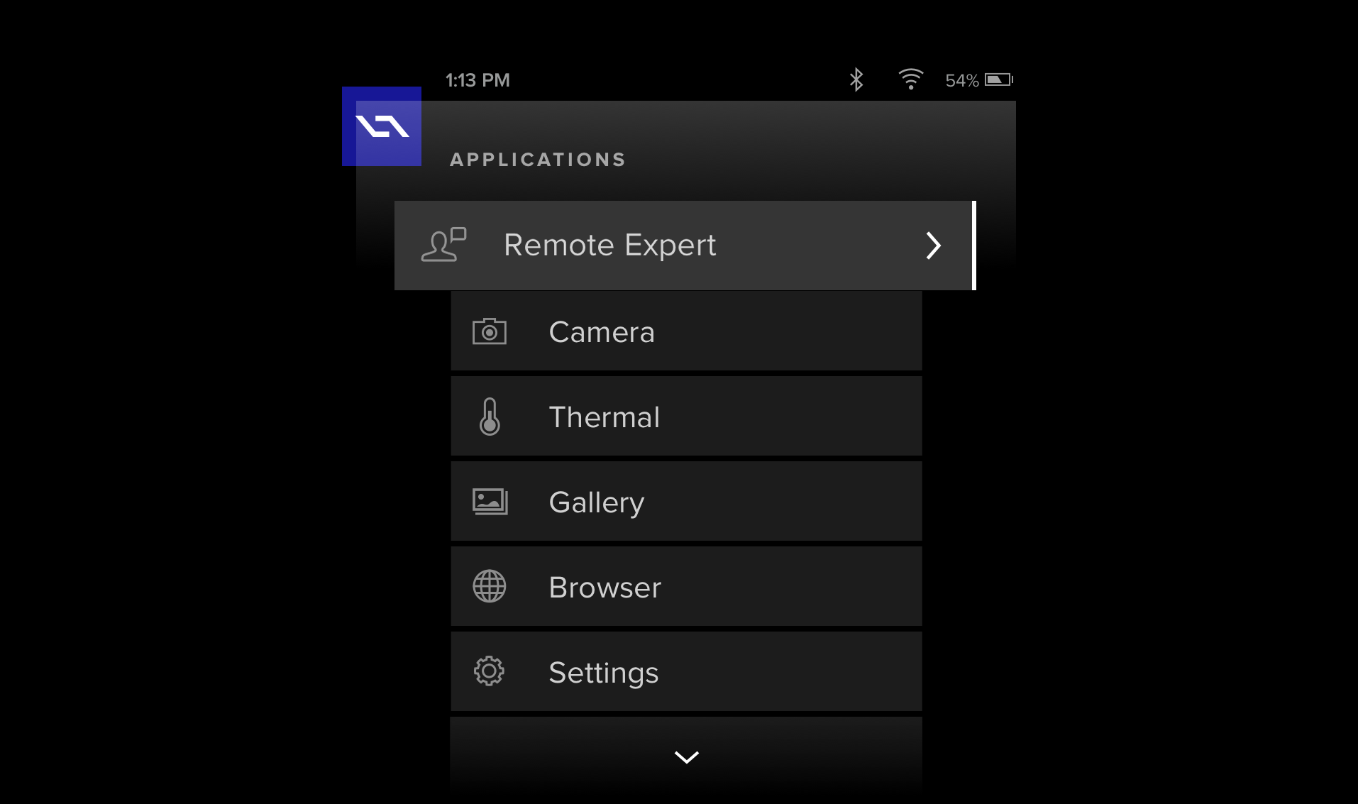
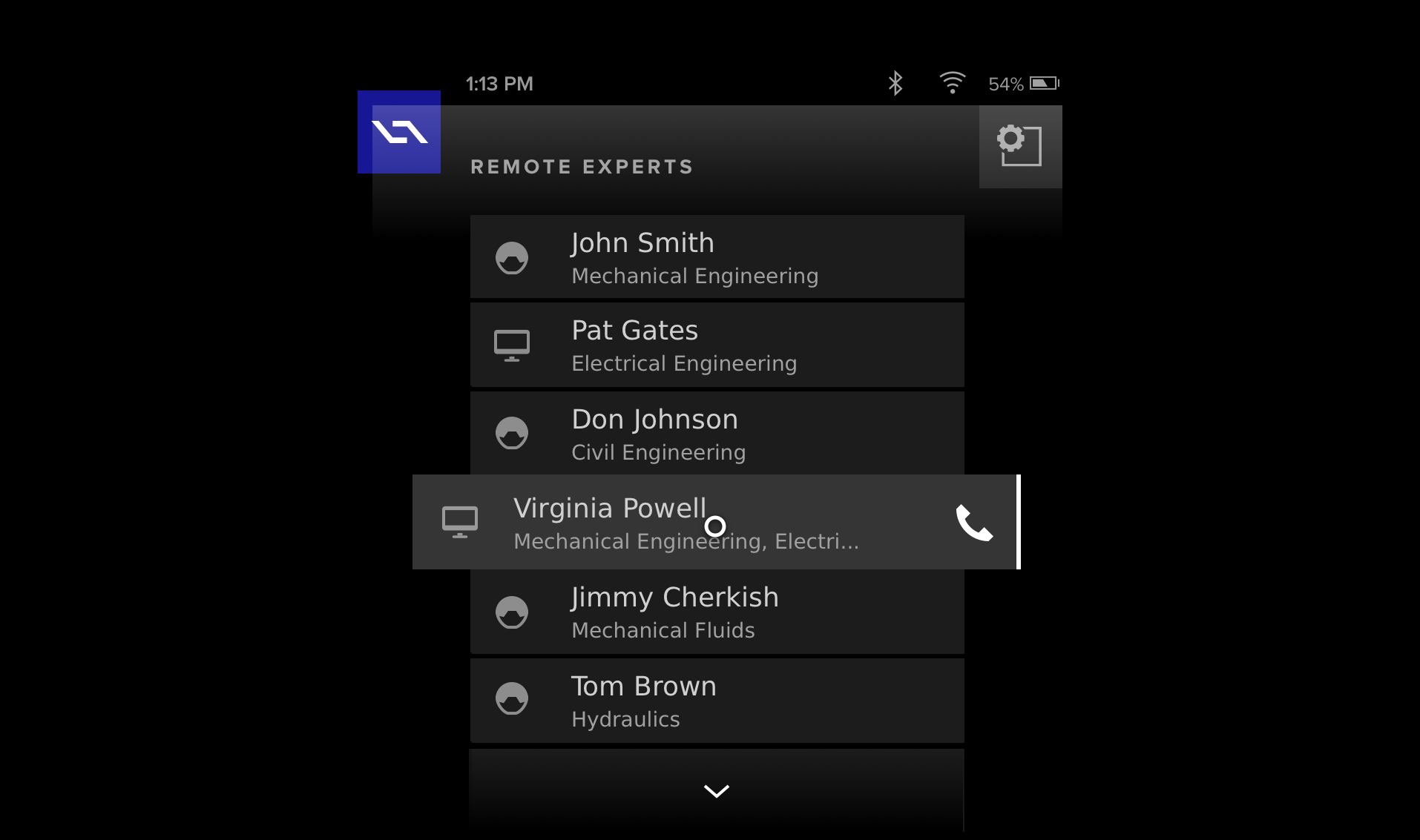
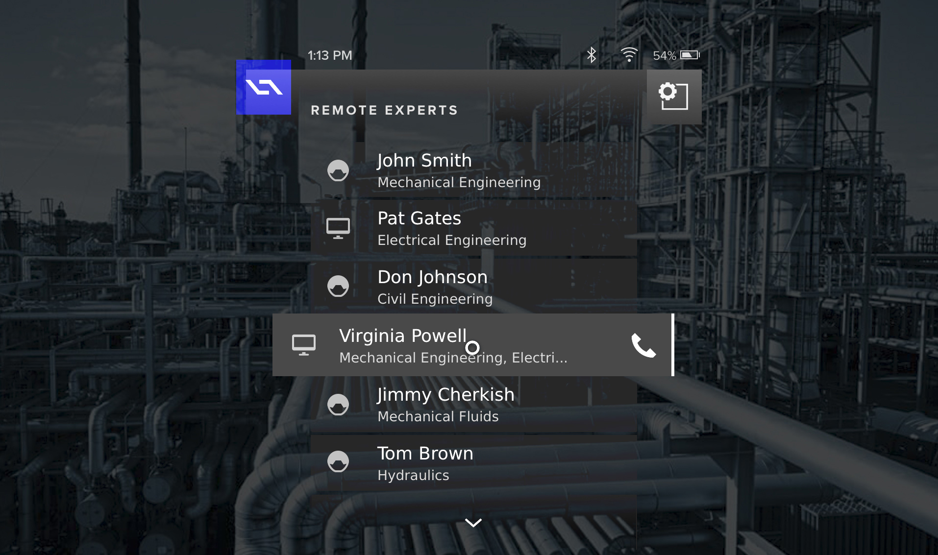
Worksense® Suite
The previous case study introduced 4D Studio as the AR Enterprise software platform that allowed planners/engineers to create and publish their own AR scenes, work instructions and workflows to mobile devices. This is the follow-on story of my journey creating our custom suite of mobile applications. Initially, a new iPad app, followed by our first-ever 4JS app for our custom hardware. At he onset, I was the sole full-time UI/UX Designer within this area of the start-up. I was tasked with extending my new comprehensive design across the following app platforms. I took a very hands-on role, designing, directing and leading most aspects of the work as I collaborated with an expanding team.
ClientDaqriServicesResearch, Ideation, Prototyping, Visual & Interaction DesignYear2018Linkwww.linkedin.com